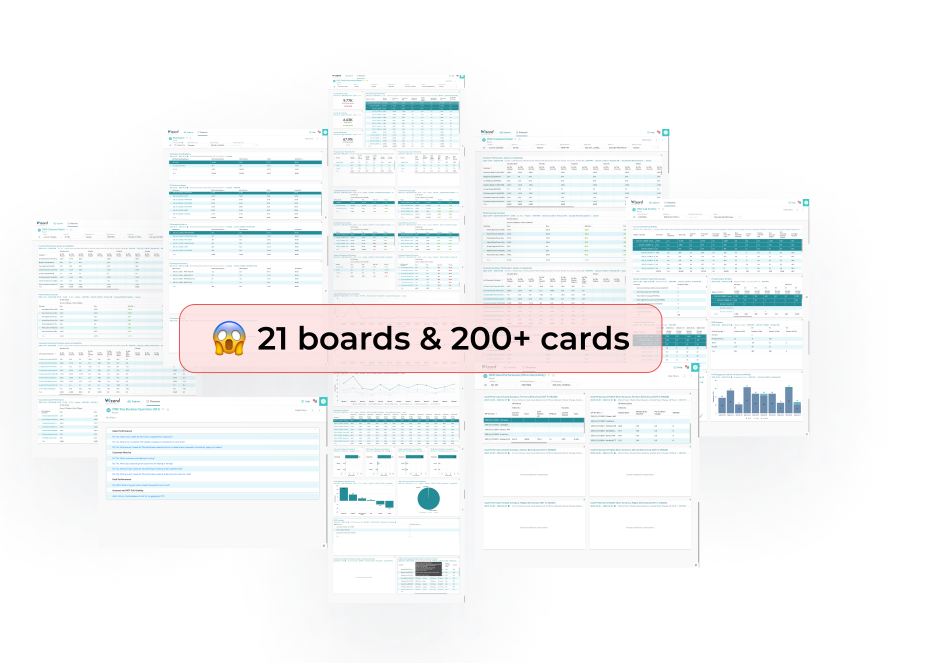
Revamping sales dashboard to empower data-driven sales decisions
Business Intelligence Tool
Data Dashboard
Sales Enablement
As a design consultant for J&J, I led the revamp of the sales performance data platform utilized by over 3,500 sales reps across the US. I condensed more than 20 dashboards into 3 essential ones, which increased the adoption rate by 12% and improved the Net Promoter Score from -17 to 67.
Role
End to end product design
- Requirements gathering
- User Research & IA Workshop

- UX& UI Design
Team
Design: 2 Product Designers
Client:
6+ business stakeholders, 2 Sales Director, 2 IT Lead
Development:
10+ developers
Timeline
Jan - Apr 2024 (Launched in May)
PART 01
Overview
Context
Wizard: The Tool Powering Data-Informed Sales Decisions for 3500+ J&J Reps
Sales reps use Wizard to analyze sales volumes and trends, identifying potential opportunities. Previously, the client utilized iQlik until switching to Wizard in 2022. Following the transition, usability issues led to a decline in adoption rates, prompting our engagement to revamp the platform.
Before 2022
iQlik
2022
Wizard Introduction
Mar 2023
VOC Survey
Feb 2024
Reimagining the experience
The Problem
Overwhelming amount of data is making it difficult for sales reps to quickly grasp insights, resulting in low adoption rates and poor NPS
Despite significant investment from the sales field operation team, the adoption rate for the Wizard sales insights dashboard remains at a low 60-70%, much under the targeted 90%. This is primarily due to usability issues that make data extraction and insight generation challenging.
“I have to set aside 3 hours just to go through the data, and I just don’t have the time”
“It feels like data paralysis. There is so much info and we only have so many hours in the day. ”
“We all want to use it, it's just too cumbersome at times. If it's easy and looks pretty we'll use it.”
The Goal
How can we incrementally improve and simplify the Wizard experience so that field reps can find the data they need to make data-informed decisions and boost sales? 
Tool Adoption
Increase the adoption rate from 62% to around 90%
User Satisfaction
Increase the NPS from -17 to a positive range and higher user satisfaction
Extendability
Solve for the Oncology TA first but extend to other department in the future
PART 02
Figuring out the root cause
Research
Users have a strong desire to use Wizard yet it’s impossible with usability and data overload issues
We heard repetitive from users that the current amount of available data within Wizard is excessive and forbid them from extracting insights. I led the heuristic evaluation process which uncovered these usability issues:
502
Survey responses
9
1-1 interviews
6
Focus Groups
50+
Hours of Research
Overwhelming amount of data is causing tool abandonment
Too much data is shown which makes it hard to quickly find important information. This is causing users to stop using the tool.
Challenged by the tool’s usability
Various usability issues significantly hinder the adoption and utilization of Wizard
Lack of insightful visualizations
Limited visualizations make analysis cumbersome, requiring considerable time to extract insights.
Overwhelming amount of data
Too much data is shown which makes it hard to quickly find information.
Challenged by the tool’s usability
Usability issues like no way to hide filter and low discoverability of switch.
Lack of insightful visualizations
Vast amounts of data tables make analysis cumbersome.
Beneath the surface
We also found opportunities to improve guidance from sales leadership and to enhance training and support
Highlight the business context for the analytics
Create synergies between systems
PART 03
Diving deeper into users needs
Personas
Different personas require varying levels of data understanding
From our interviews, we found that managers prioritize overall performance and prefer in-depth data exploration. In contrast, sales reps seek quick access to pertinent data. Initially, our plan was to satisfy both groups' needs with a unified dashboard.
Low level
High level of data understanding
Stakeholder
Keep Satisfied
Key Metrics
  • Level 5 account performance
  • Sales team overall performance
Primary User
Secondary User
Key Metrics
  • Level 5 Top performing accounts
  • Janssen vs. Competitors by EuTRx
  • Region and district growth
Stakeholder
Keep Satisfied
  • Ambitious, goal-oriented leaders
  • Focus on on positioning their sales teams for success
Primary User
Secondary User
  • The go to source for expert knowledge among peers
  • Willing to dig the data to identify underlying insights
Our Focus
Different personas require varying levels of data understanding
From our interviews, we found that managers prioritize overall performance and prefer in-depth data exploration. In contrast, sales reps seek quick access to pertinent data. Initially, our plan was to satisfy both groups' needs with a unified dashboard.
Future State Workshop
Utilizing data and insights to suggest consolidating into three dashboards that address the 'what,' 'why,' and 'how'
Leveraging key business questions, most used dashboards, and interview insights, we propose to consolidate all dashboards into 3 primary ones. These dashboards aim to elucidate the "what", "why", and "how" of their sales data
In Person Collaborative Workshop
Stakeholders: 2 sales leaders, 2 IT leaders, 5 home officers, 3 designers
Duration: 5 hours
Location: Client office in Pennsylvania
PART 04
Align, Test, and Iterate
Testing & Stakeholder Alignment
Keeping it intentionally B&W to focus on the core insights
We engaged key stakeholders at every stage of the design process to evaluate feasibility and confirm that our solution aligned with the needs of the business and the user. We strategically utilized low-fidelity prototypes to minimize distractions, allowing stakeholders to concentrate on the essential insights.
15
Total meetings to review designs and feasibility
6
Feasibility sync with the Technical & Wizard Team
4
User Testing Sessions
3
Design reviews with the home office team
Iteration
We recognized that a one-size-fits-all solution is ineffective, so we divided it into two distinct views.
Based on user testing, we found that combining views for sales representatives and managers is ineffective due to their differing goals. We decided to design different dashboards for DMs & Reps to cater to their specific needs.
Easy Mode for Sales Rep
- The default filter is set to their territories
- Individual customer info is prioritized on top
- Corporate customer details are folded at first
Expert Mode for Data Wizard
- Switch between district, region and territory
- Level 5 customer info is prioritized on top
- Ability to deep dive into data
UX Strategy
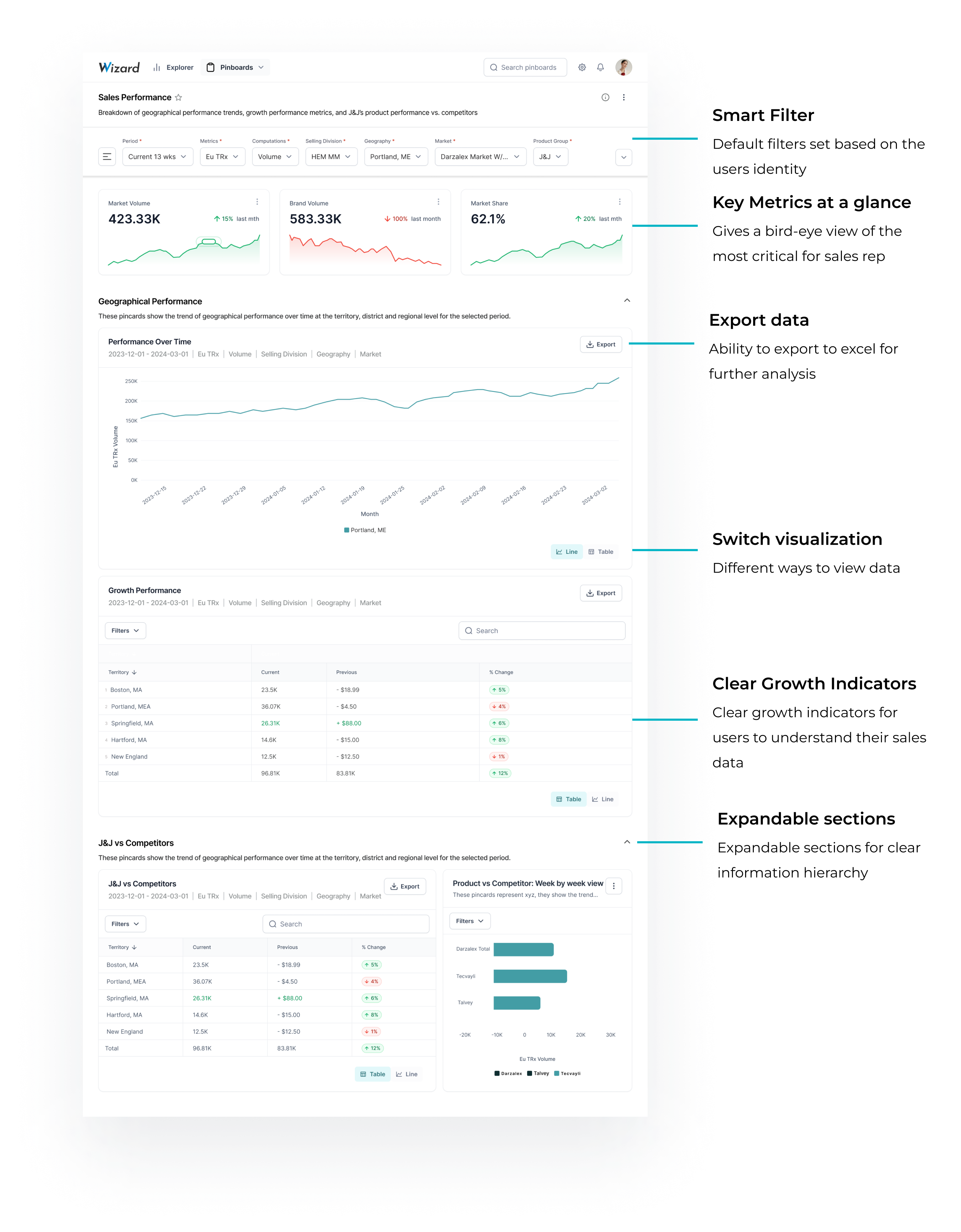
Adapting to tool limitation, I proposed immediately implementable and future state design which won the consensus of stakeholders
I proposed both immediate and long-term solutions to address the limitations of Wizard, successfully convincing the client to agree to data model modifications, enhanced features, and visual design improvements.
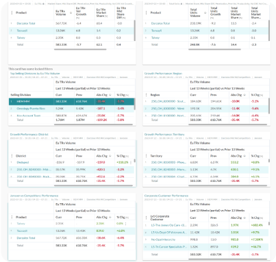
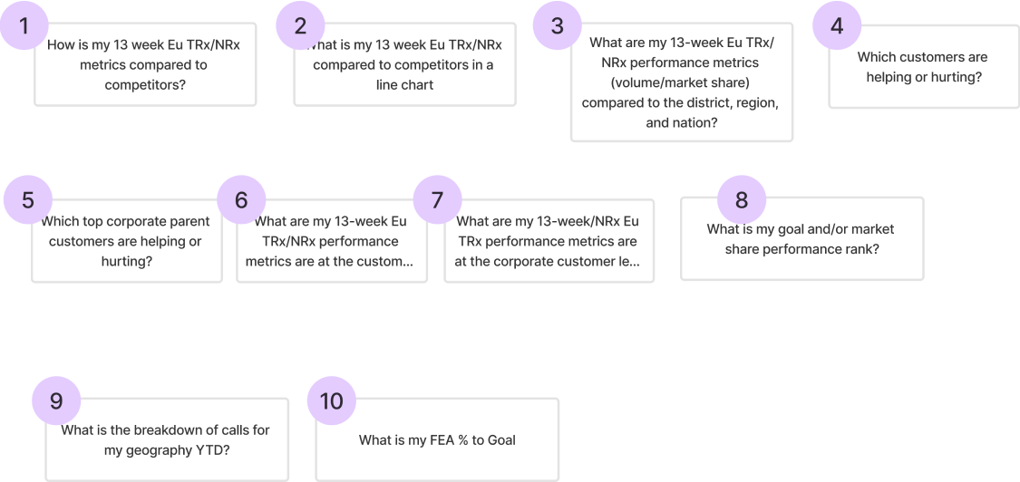
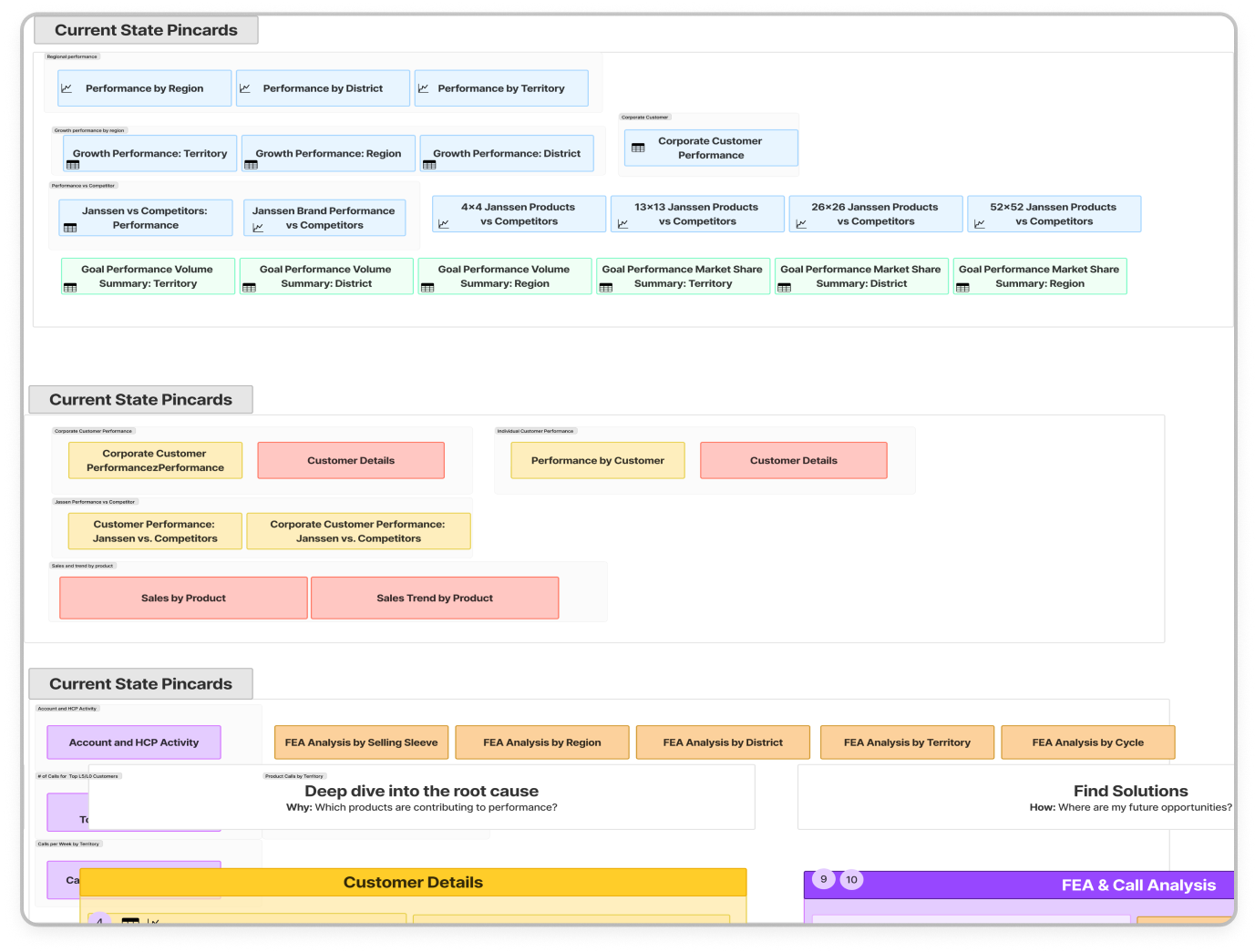
Current
Elevated Visual Design
Supportive Features
Refined Data Model
Proposed Future Version
PART 05
Help users answer the what, why, how with 3 concise borads
The What: Performance Landing Page
Performance landing page will become
the default landing page
for users to view high level metrics, understand  performance of their territories, growth trends, and performance vs competitors
The Why: Customer Details
Conduct detailed analysis of the customers and accounts that drive sales and compare against competitors.
The How: Call Activity
Learn how to enhance sales results by delving into call activities to uncover opportunities.
Impact
Users are enjoying the simplified experience
Currently, The revamped platform for the Oncology TA has been successfully launched and is actively utilized by 500+ sales reps. 🎉
90%
reductions in boards & cards amount
12%
increase in product adoption rate
-17 --> 67
net promoter score
"I appreciate the simplicity; it reduces choices and appears much easier for me."
Lee
Sales Rep in Northeast Territory
"This motivates me to investigate further. I appreciate the simplicity and immediate clarity."
Ann
Sales Rep in Northeast Distrcit
"It tells me right away what I need to know. I think the field is going to love it. "
Lee
Sales Manager in New England Region
Reflection
Finding a balance
1. Balancing user needs with constraints
This project has been instrumental in teaching me how to navigate constraints while still exceeding expectations. By proposing both immediate solutions and visionary future designs, I help clients envision improved outcomes, facilitating their buy-in.
2. Educating business stakeholders on design’s value
In consulting, our interactions often involve traditional companies unfamiliar with design roles. A crucial aspect of my role is to educate these stakeholders about the benefits of human-centered design. This process has enabled me to establish strong relationships with my clients, emphasizing the strategic value of design in business contexts.