
Brushing Up on Brilliance...
Almost Ready!
Almost Ready!


Product & Interaction Designer
Team Coordinator
4 months
May 2021 - Sep 2021
Big Platform under (CDX)1 PM, 1 designer, 10+ engineers
Figma, Principle, Sketch, Excel
In the summer of 2021, I interned at DiDi Global which is the leading firm in providing mobile transportation services in China, similar to Lyft and Uber in the US.
During my internship at DiDi, I worked on several projects including redesigning the comment feature and designing a Sketch plugin for Mofang which is the R&D collaboration platform used internally at DiDi.
From research, UX, visual design to prototyping, I was fortunate to own the problem, lead the project with guidance from the team, and ship the feature.
1. Complete the end-to-end design process for redesigning the comment feature within the design board
2. Collaborate and communicate closely with design leads, PMs and engineers within the team.
3. Analyze and synthesize user feedbacks, research and backend data to find out existing problems and iterate on current designs.

Project collaborators need a way to add and manage comments more effectively to better incorporate feedback throughout the design process.

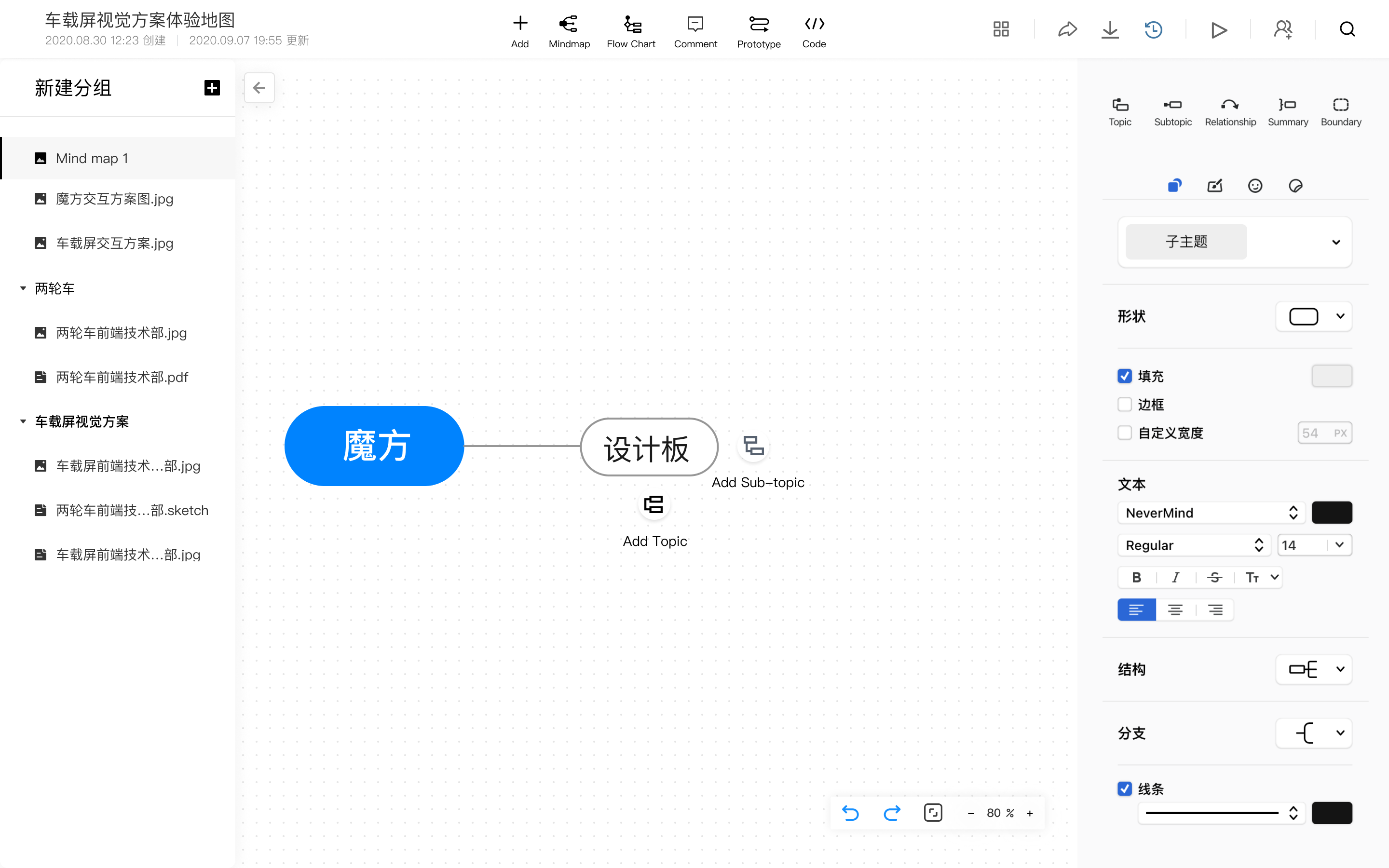
I designed a more streamlined process of adding comments and added a comment list. Comments clicked in the list will be located automatically on the canvas screen, and vice versa, so users can locate comments quickly and organize comments more efficiently.

The new canvas page design

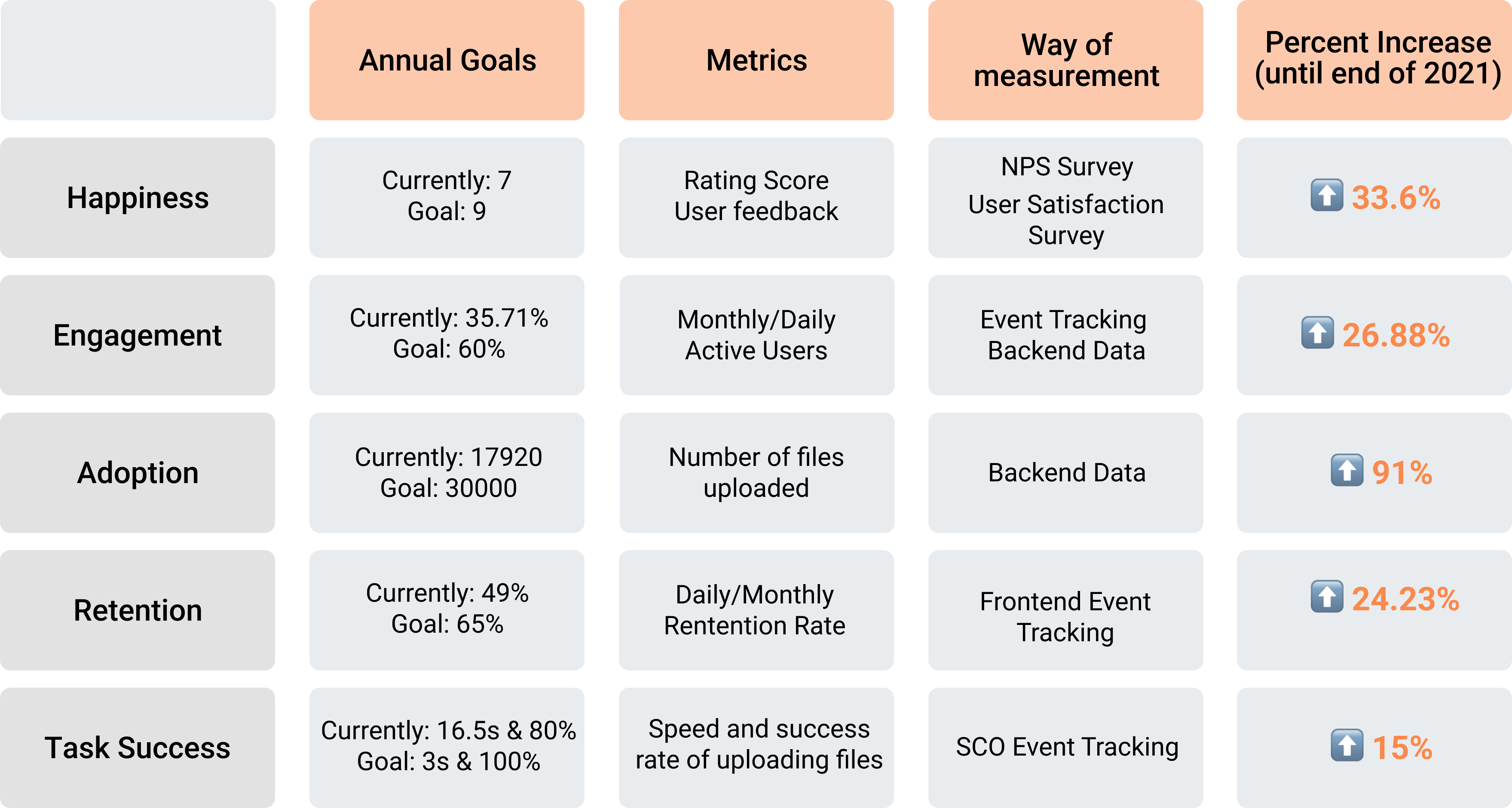
Through our internal data management platform MoJing and NPS Surveys, we saw exciting results after my designs were developed and launched.


reduction in time to make comments


in user satisfaction

in Daily Active User (DAU)


Back-end Data Analysis
Problem Space
Interview
Competitive Analysis
Stakeholder Analysis
UX Flows
Sketches
Feature Prioritization
Low fidelity sketches
Prototyping
Designer & Engineer
Review
NPS surveys
User Testing
Back-end data
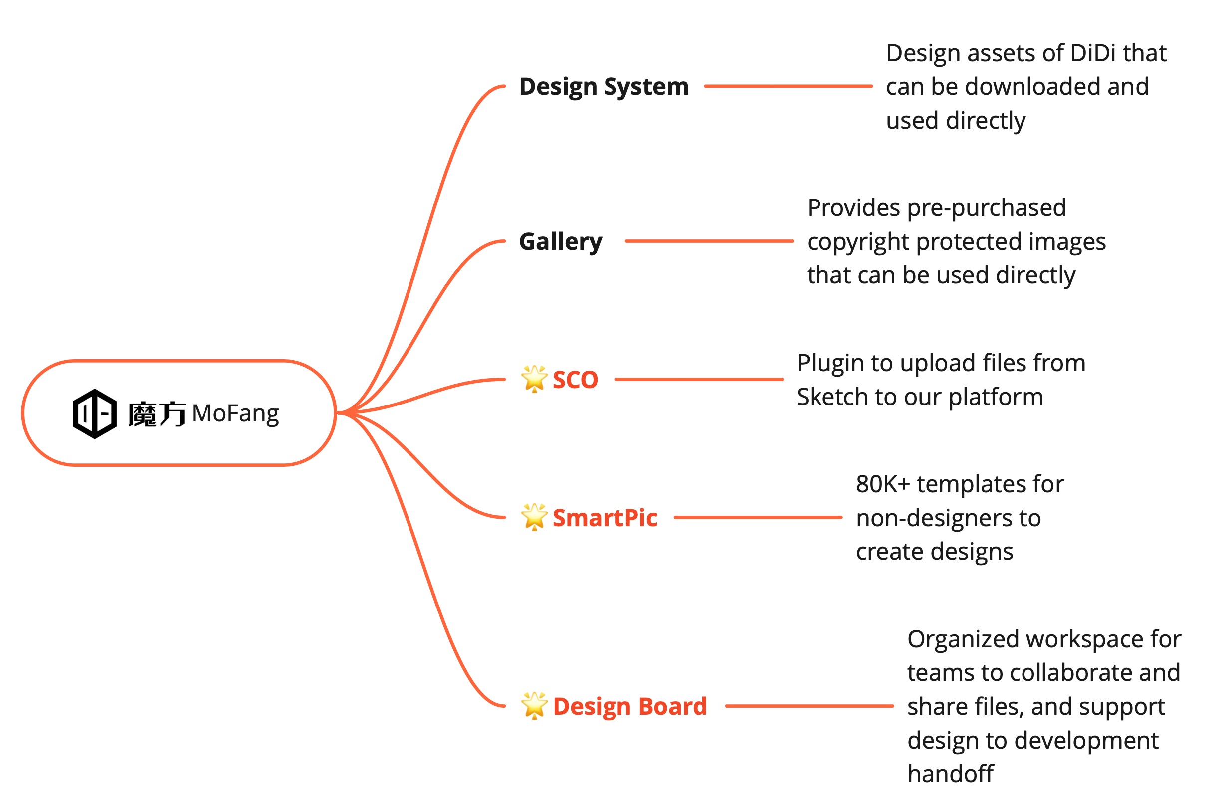
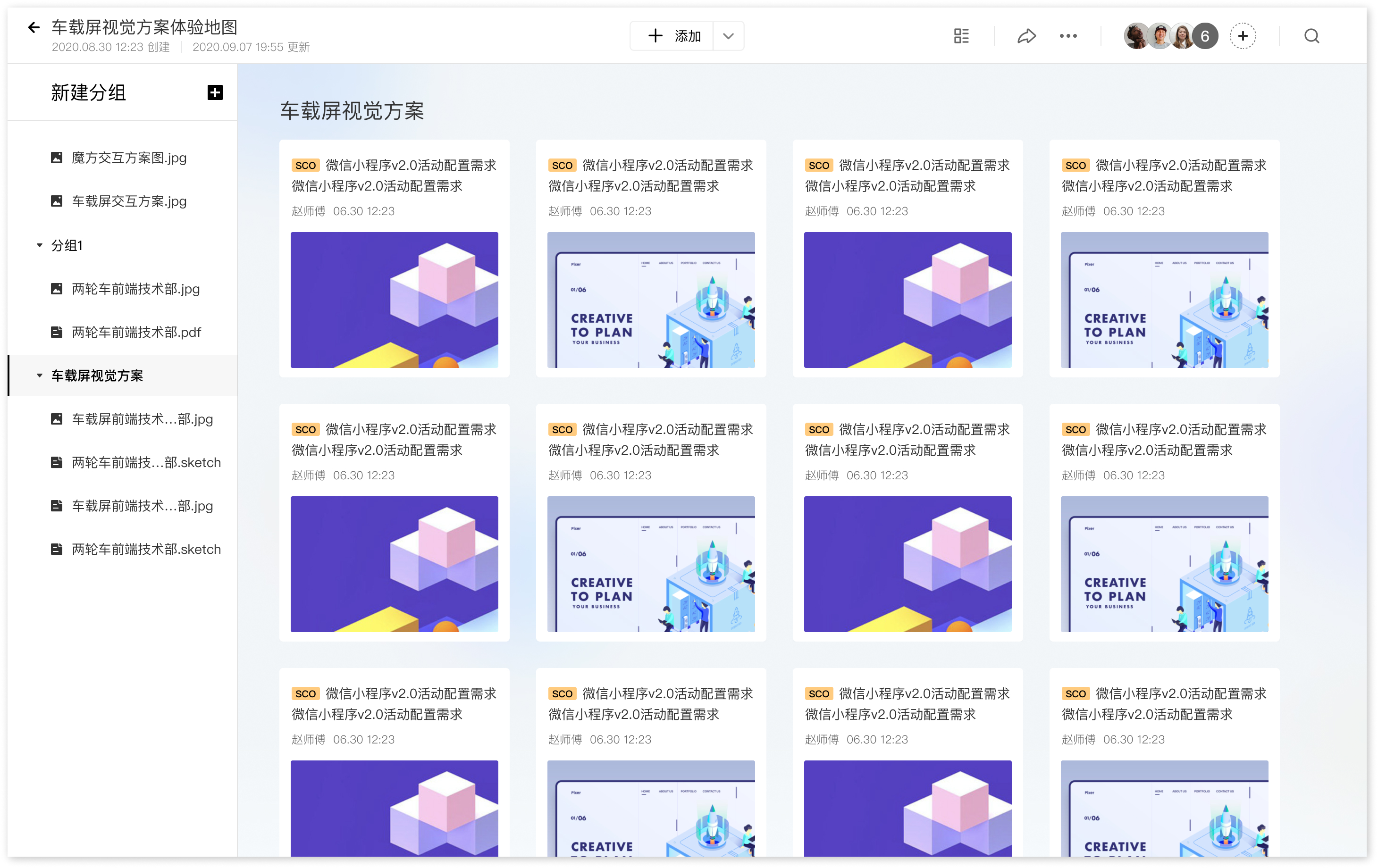
Sub products of MoFang
MoFang is the Research & Development collaboration platform developed and used internally at DiDi which is similar to InVision, Zeplin, or Figma. The platform currently has 5 sub-products and over 15,000 users. The mission of MoFang is to make work simpler by improving the collaboration between different roles along the product line. I worked specifically on the Design Board, SCO plugin, and SmartPic which are essential for the design to development hand-off process. We partnered with Gaoding Design to incorporate a new product called SmartPic which is similar to Canva into our platform.
I was first introduced to the problem space by my design lead and he provided me with a task to increase the use of comments. To kick off the project, I first examined previous data on user feedback and backend statistics, and here are the insights I have gained and the initial problem I have proposed.
1. Not aware of the feature
2. Hard to manage comments
3. The feature has many bugs
From NPS Surveys and backend data, 87% of users reported that they have never used it before.
Users often get overwhelmed by the amount of comments and it's hard to find a particular comment.
A lot of users have reported that the feature has many bugs and is confusing to use through our internal feedback system.
How might we maximize the utility of the Comment feature by encouraging users to contribute, share feedback, and comment on each other’s work?
To further understand the problem I am designing for, I conducted a series of research to understand how designers are receiving and sharing feedback to identify their pain points and needs surrounding these processes.
I began the research process by deeply exploring the platform myself and analyzing existing flaws with the feature. Here are several notable problems I have found:

To gather insights on the usage of the feature, I Interviewed 5 of our key users within the company including two designers, 1 PM, and 2 engineers. I asked questions about their general usage of the feature, how they are keeping track of feedbacks currently, and whether they use the comment function on other platforms. Many interviewees reflect that they have rarely used the function since it’s unnoticeable and they prefer talking directly on messaging platforms.
“The comments are out of order and it seems very disorganized. ”
-Siyuan, PM at DiDi Express
“Sometimes the comments I have created just disappeared, and later I found that it's in a different file.”
-Annie, UX Researcher
“When my teammates point out certain problems in meetings, I didn’t document them right away and forgot about them later.”
-Bonnie, Designer at DiDi Bike
“When I am in a giant project file, I had trouble finding a specific comment for a specific file. ”
-Mei, UI designer
“I can’t find the comments that have been created when there’s many files within the project.”'
-Lu, UX Designer
“I have never used the comment function and I don’t even know it’s there.”
-Allen, Front end engineer at IBG
"It's very confusing to use as I am not sure whether I am in the comment mode or not. "
-Lu, UX Designer
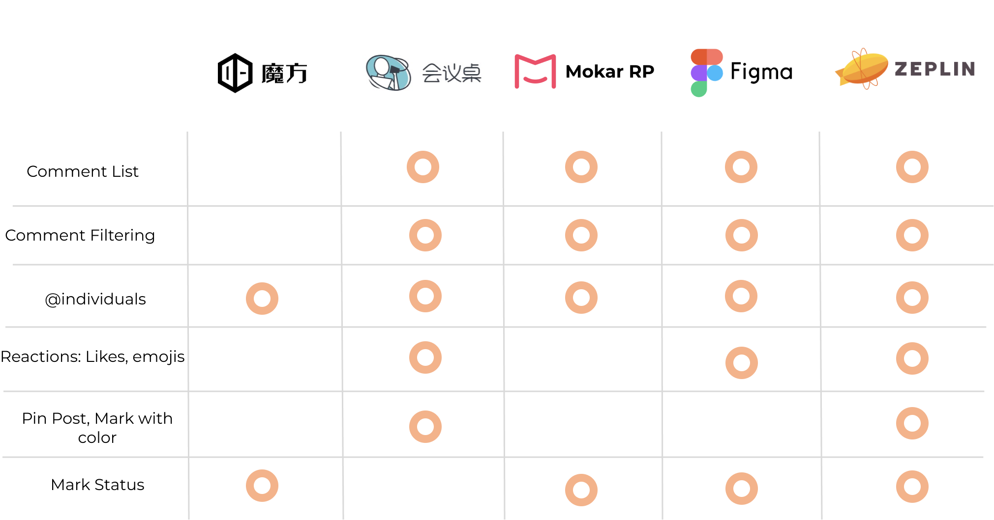
I compared our product with similar R&D collaboration tools on the market to see what kind of function is available and examined what’s essential for our MVP product. I focus specifically on how these platforms foster collaboration between different roles in the product team.
Key insights:
Based on previous research, I synthesized that we have 3 main types of users: designers and leads who are mainly owners of projects and also our primary user, PMs and operators who evaluate the designs from the business and practicality side, and engineers that conduct the implementation. Since designers are our core users, their needs and frustrations will be the most essential for my redesign.

From secondary research and user interviews, I am certain that users need a way to synchronously document problems and ideas, and collaborate asynchronously. However, the functionality of Comments hasn’t been utilized to the greatest extent since the mode is unnoticeable and comments can get disorganized. I synthesized that a good design of Comment should provide the following opportunities:

Straight to the point
Comments point to specific problems within the file

Assign to individuals
The ability to @team members

Organization of comments
A comment list to keep track of comments on all pages

Facilitate Quick responses
Connected with D-chat(the internal messaging tool) so users get notify quickly
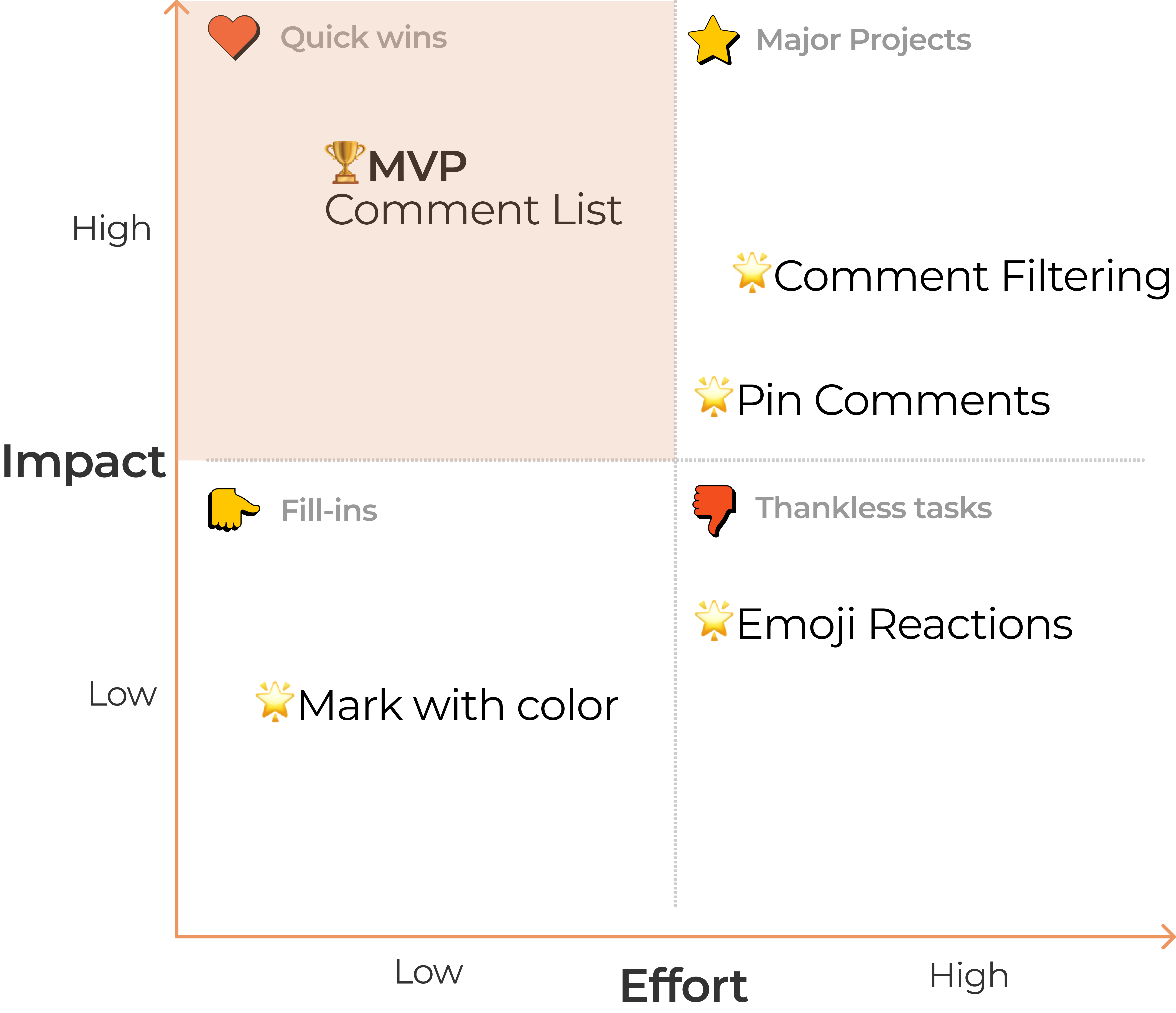
Based on the design goals, I generate four possible features including filtering comments by resolved state, the person created, red dots to indicate whether the comment was read, and search comments. To narrow down the features we want to implement, I constructed an impact-effort matrix to evaluate which feature would be most impactful. After talking with team members, I decided to mark the Comment list as our MVP feature since it has a relatively low amount of engineering cost while bringing a high amount of impact to the feature.
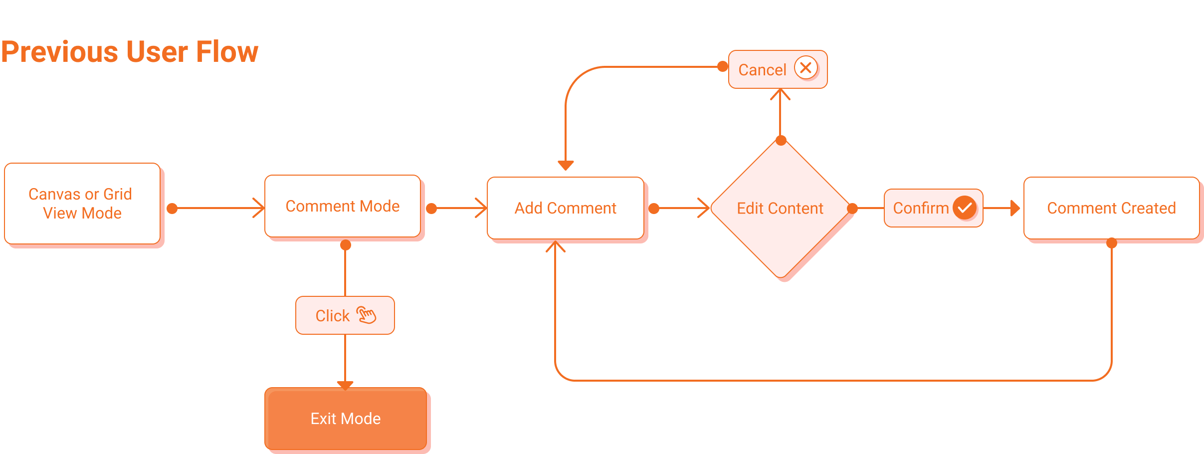
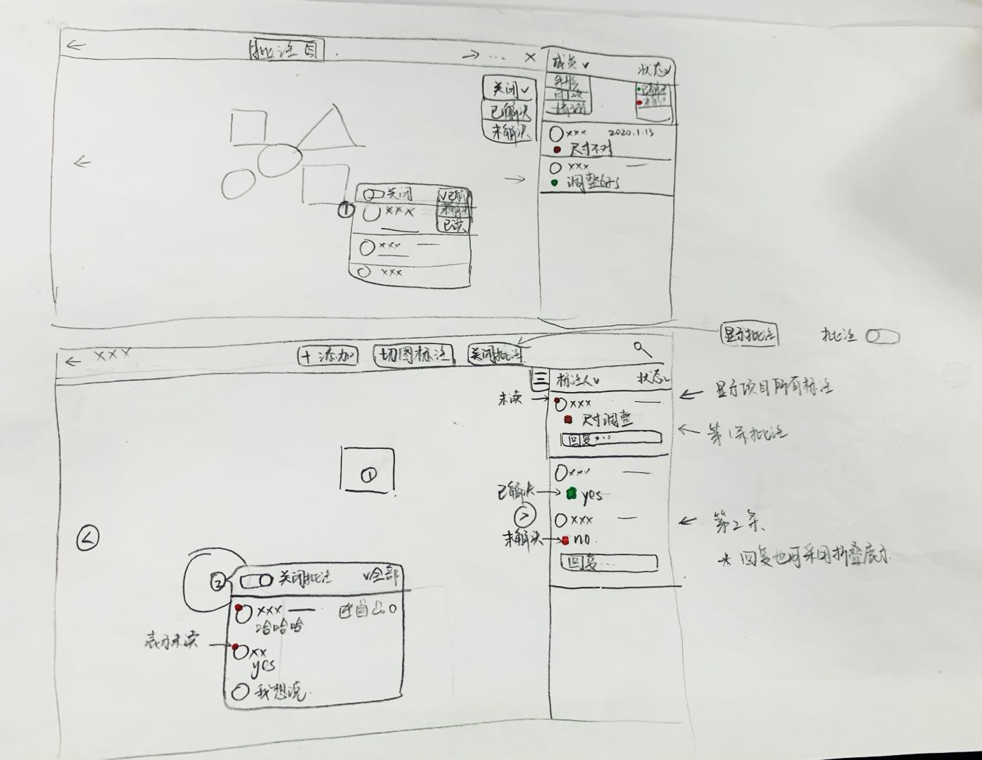
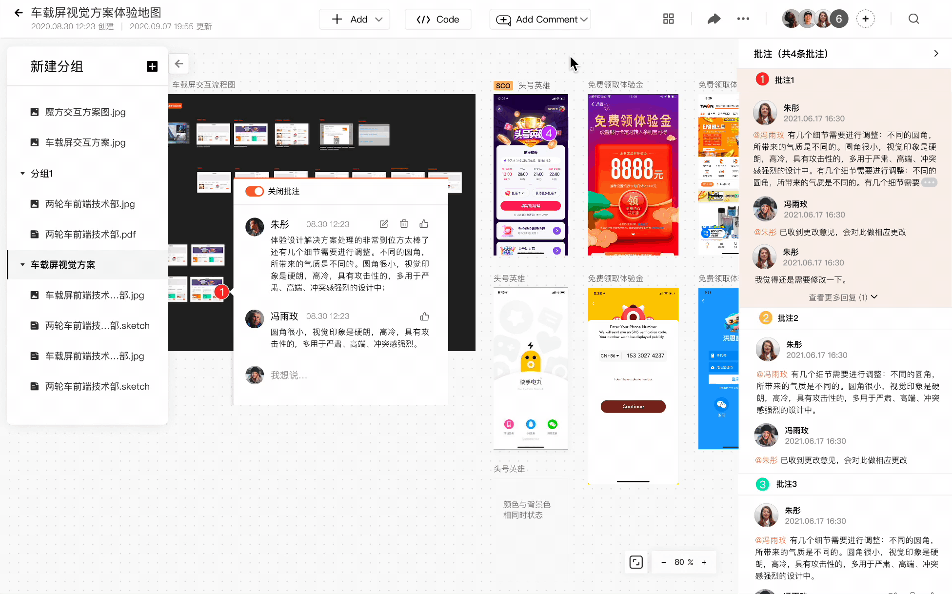
Previous problem with comments was that users are not aware of the feature. In order to expose the function further, I decided to change the comment button from entering a mode and adding unlimited comments to a feature that adds a single comment each time. The benefit of this change is that users see the comments directly when they enter the Canvas.

Using the user flows as a guideline, I made several sketches before starting to prototype and talked with my design lead and engineers on the team to make sure that my ideas aligned with the product goal and were technically implementable. Making sketches helps me with ideating quick thoughts and making iterations quickly.
Using existing assets from our design system library, I started to compose mid-fidelity prototypes from the sketches made and discusses with my mentors and engineers on design critique sections every week for feedbacks. Here are several key design decisions I have made:
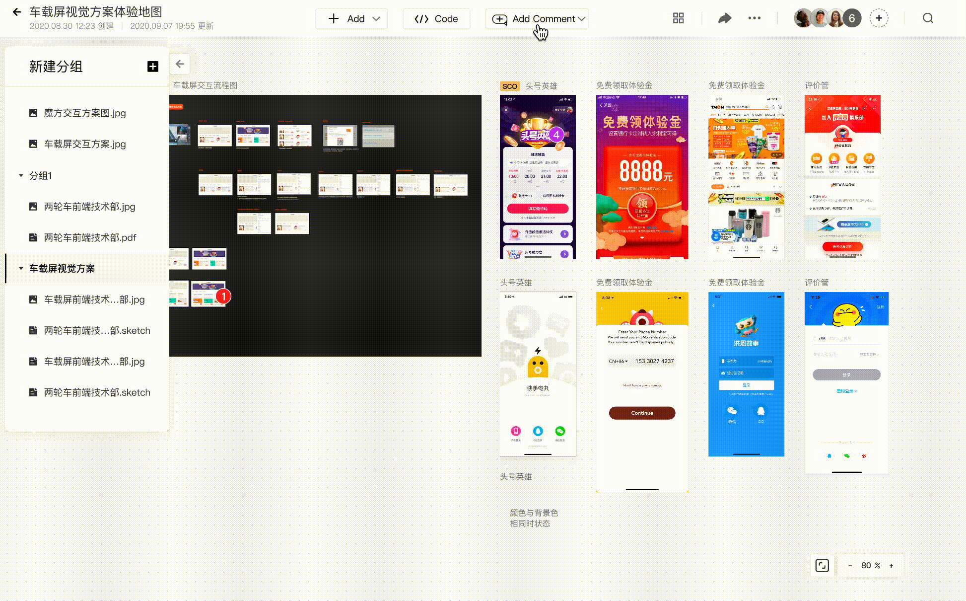
There's two mode for users to view the files: the Grid mode and the Canvas mode. One huge problem with the Grid Mode is that users can't examine all the design files within a project comprehensively and the comments are disorganized. Aligning with the product's future vision, I decided to use the Canvas Mode as the priority viewing mode so users enter the Canvas Mode first when they open a project. In this way, users can examine the files within the project holistically and read the comments more easily.
Grid Mode
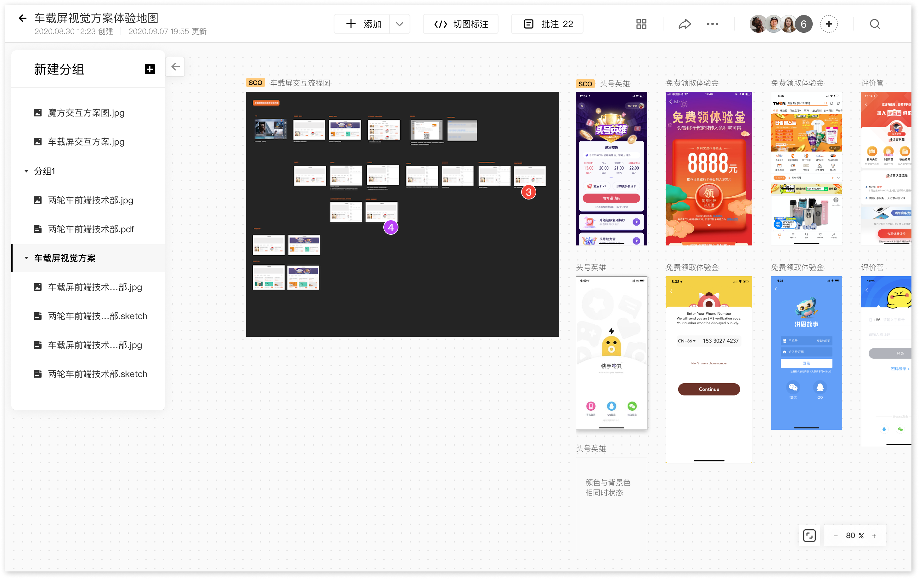
Canvas Mode (Enter this mode automatically)
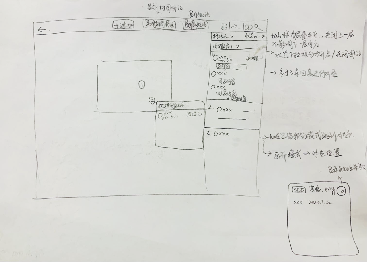
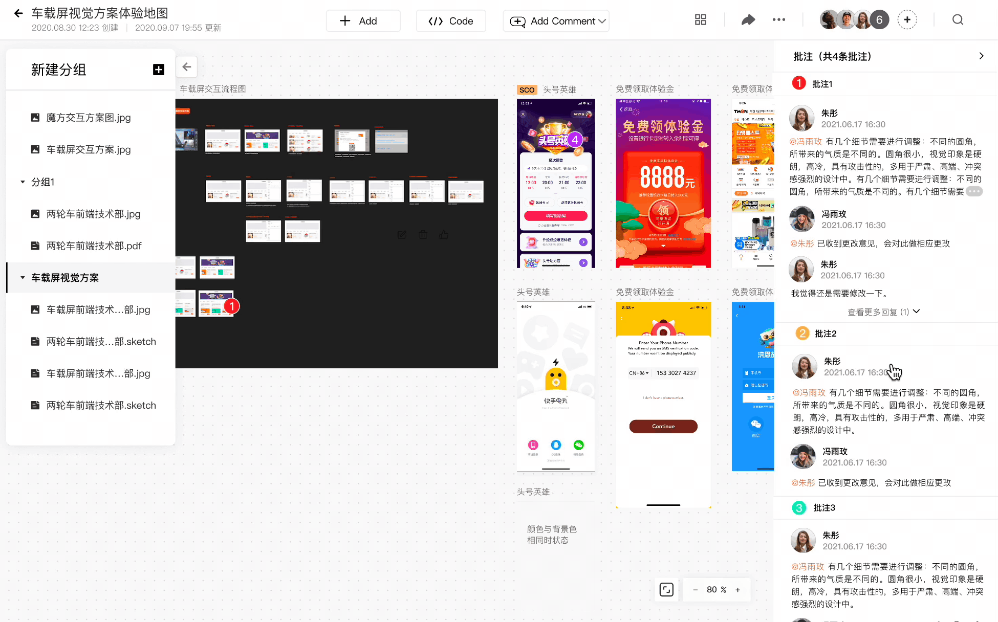
A major problem with the comment feature previously was that comments are hard to find and organize within a project with lots of files. To solve this problem, I added a comment list to keep track of all comments in a project and quickly locate comments within the canvas using a two-way positioning mechanism. If users click a certain place on the list, it will lead to the specific place within the canvas and works the other way around as well.

Comment list with the Canvas View
Since there are other functions such as code generation and history version that would also evoke a side tab, I have to consider how these overlaying tabs interact. I decided to overlay the newest opened tab on top of the previous tab so closing the current one would reveal the tab underneath.
Closing the overlaying tabs
Since there are different states when users trigger various actions, I prototyped each state and added description text underneath. This helps me with considering edge cases and the description will help PM and engineers to understand my design.
Different states and edge cases
After finishing the prototype, I invited 4 additional frequent users of 1 PM, 2 designers and 1 engineer to conduct usability testing. I composed a usability testing guide and a set of tasks for users to accomplish. My research focus on these aspects:
To make the list easier for users to navigate, I choose to fold threads with more than 5 lines or more than 3 threads within a single comment and give the option to "View more". I also highlighted the comment being selected and the person mentioned to help users navigate and understand the content more quickly.
I made several iterations to decide where would be the best place to put the "Hide Comment'' button that most strongly aligns with users' mental model. I finally decide to move the button to show upon hovering over the "Add Comment" button. The arrow on the button guides users to click the hover interaction and it won't interfere with users viewing contents on the canvas. Although a drawback of this design is that it might be hard for users to identify it first, we can use an onboarding guide to instruct the users at first.

Add comments smoothly
Comment button changes from entering a mode to a function so users are able to add comments quicker and smoother without confusion.
Locate comments quickly
Users can located a particular comment from clicking the comment point on the Canvas or clicking the comment in the list.
Show/Hide comments easily
Users can hide all comments if they feel interrupted and extra content in the list are folded to avoid information overload.
I also worked on other product optimization and new feature ideation projects across different sub products including redesigning the flow of adding and sorting project, ideating the flow of incorporating mind map and flow charts into the Canvas mode, and designing a Sketch plug-in allowing designers to upload files from Sketch to our new platform. My designs have been shipped with the 2.1 version update of our product in early November of 2021.

Our team uses the HEART framework by Google to evaluate the overall user experience of our platform and measure the impact of updates. For the Version 2.1 update launched in November 2021, we have met almost all of our goals and here shows the improvements as a result of our update. I contributed to 3 out of the 6 new features release which means my accomplishments are presented heavily in these results.
Although It was my first time living by myself in a city for so long, I had a lot of fun hanging out with team members, new friends made, and exploring around Beijing. I am very grateful for the experience and all the team members for embarking me on this wonderful journey.
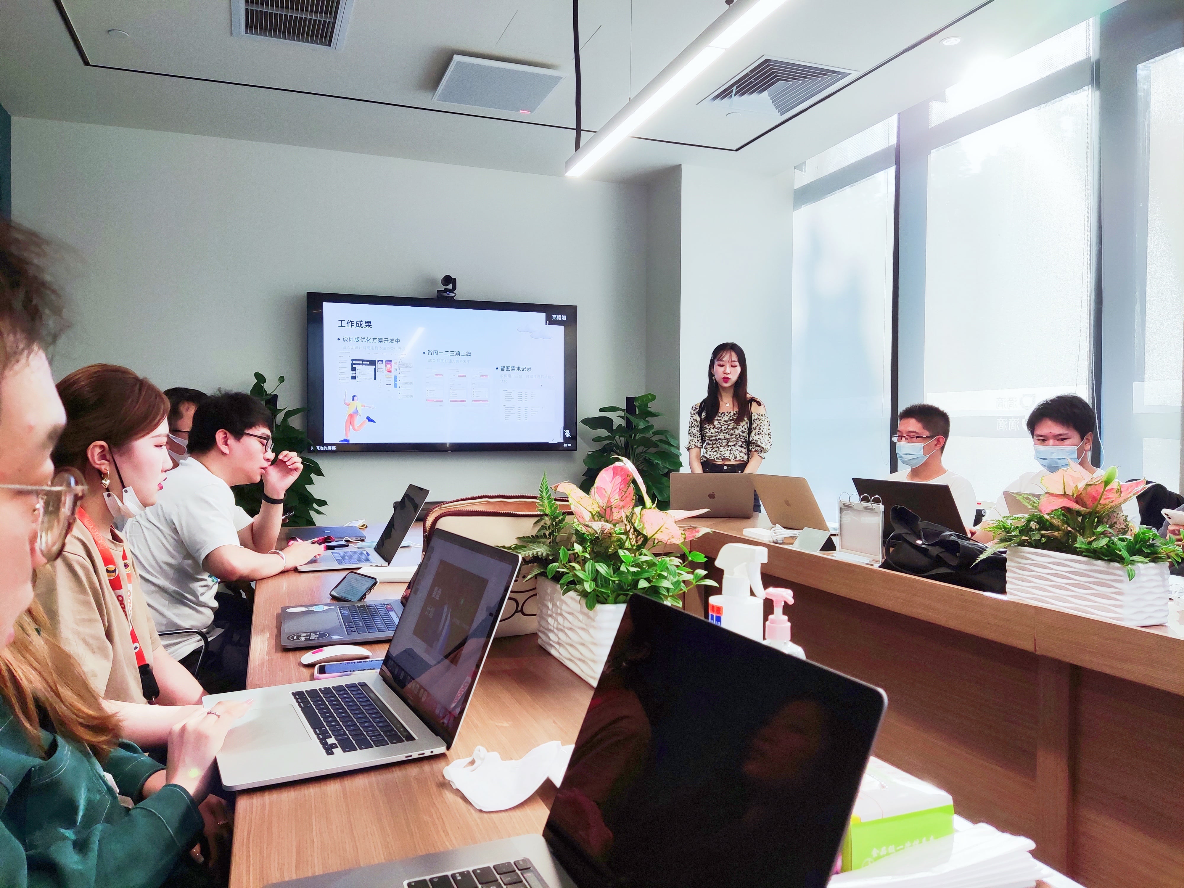
Making project presentations

Being the No.26989 staff at DiDi
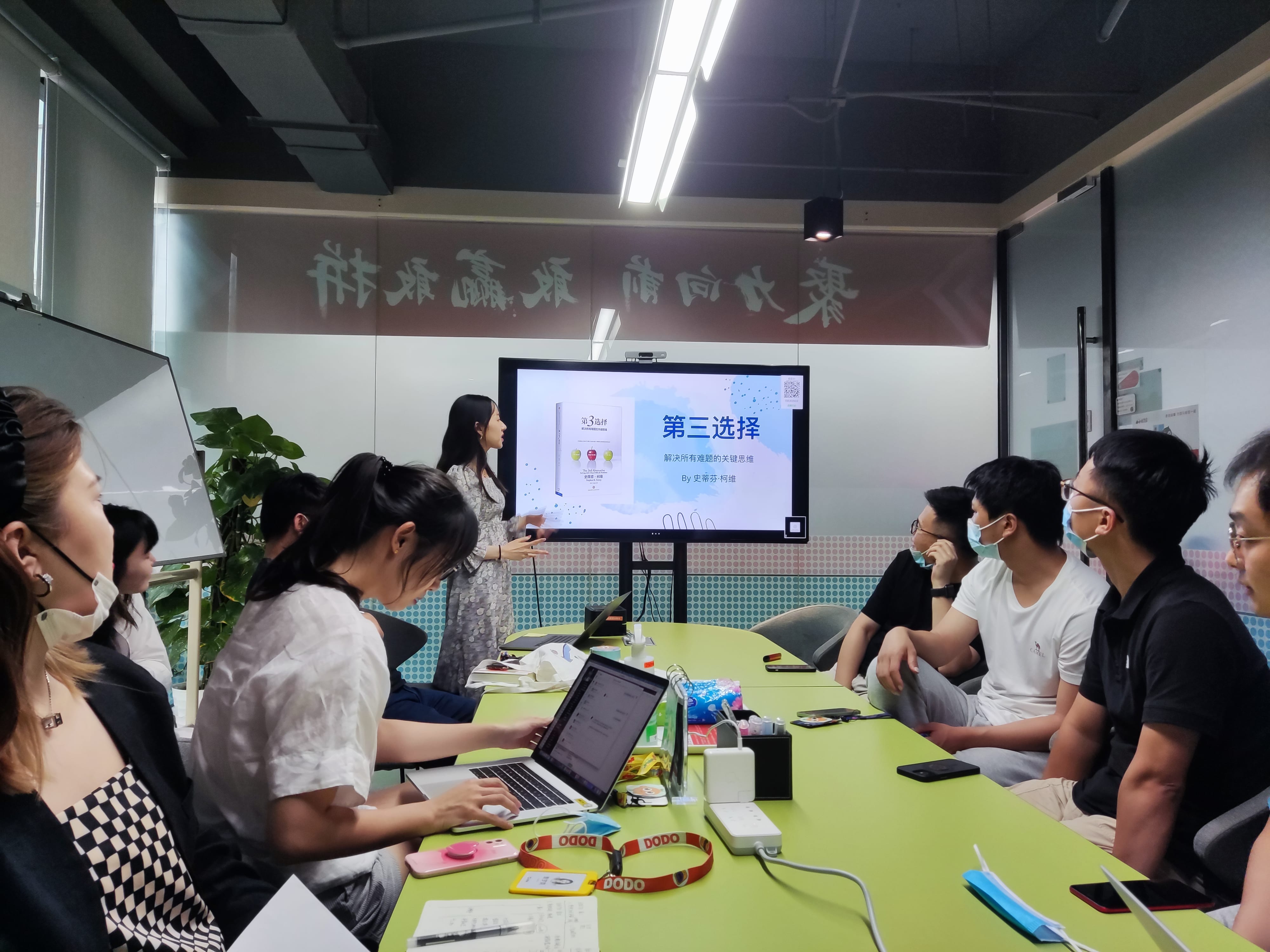
Sharing books with my team
Going to Karaoke with the team

Visiting the Forbidden Palace


.svg)