
Brushing Up on Brilliance...
Almost Ready!
Almost Ready!
Redesigning the #1 food waste app
Conduct user research & testing
Sketch wireframes
Rapid Prototyping
3 months
January 2021 - March 2021
Yumei Feng
Rou Wen
Brain Han
Emily Zhang
User Research
Figma prototyping
Usability Testing

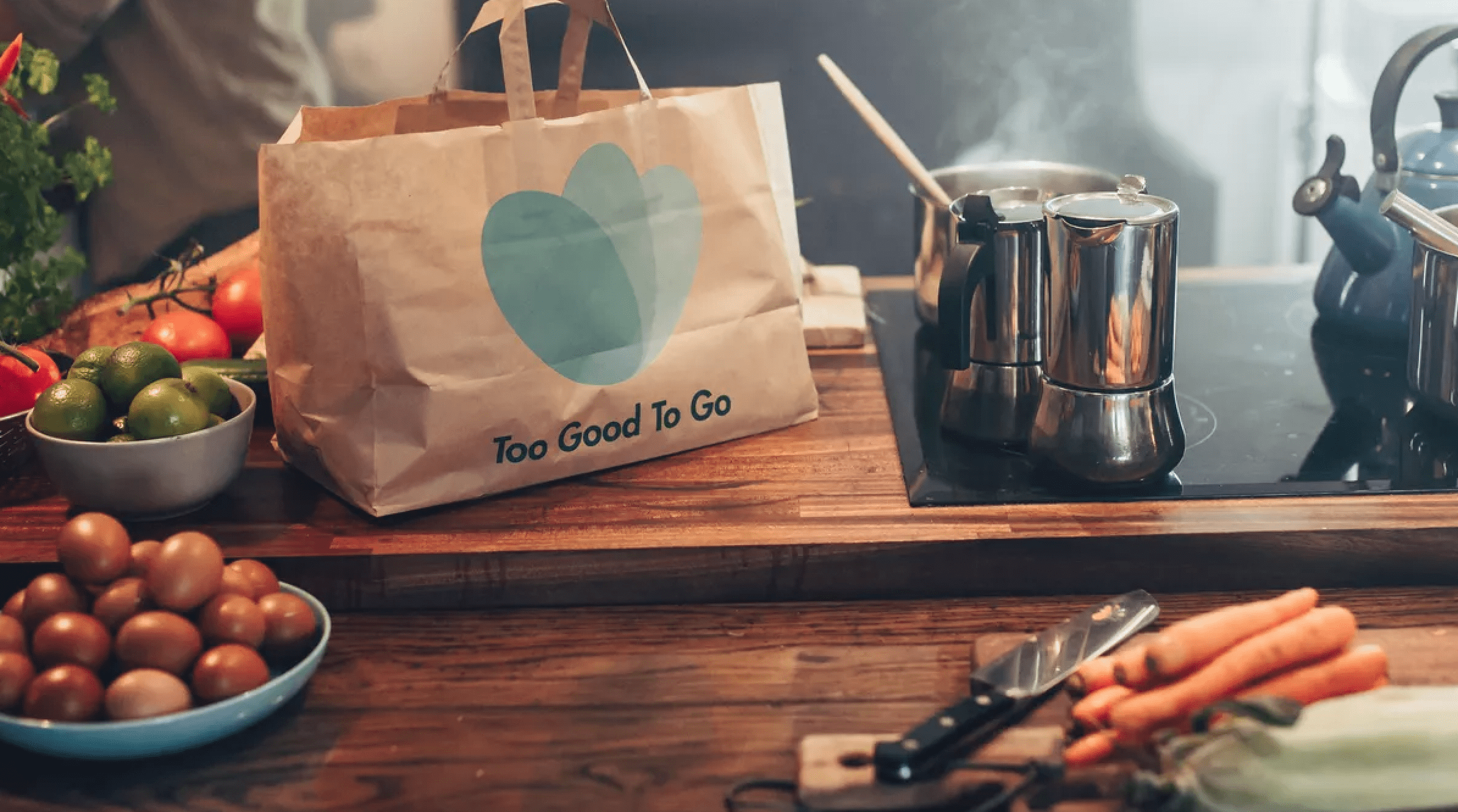
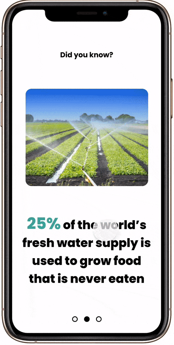
Do you know that ⅓ of all food produced is wasted? Food waste has become an issue at stake as many people are experiencing food insecurities while an increasing amount of nutritious food is getting wasted. In a team of 4, we expanded features of Too Good To Go, an app allowing users to buy surplus food from nearby restaurants at a discounted price, thus motivating users to start or keep combating the global food waste crisis. After completion of the project, I personally take on the lead to redesign the restaurant detail page to enhance trust between buyers and the sellers.

In the early ideation phase, we were interested in both food consumption and sustainability education. We eventually decided to combine these topics after finding these stunning facts:

In order to observe people’s awareness regarding resource waste, we conducted extensive online community observation and 5 in-depth interviews with mostly young working adults. We gathered the following insights:
“I know food waste is a real problem, but I am too busy to actively combat it and I am not sure how. "
- Lina, 24 years old, Microblading Artist
“It's hard to persist with the effort, I wish there's a way to keep people informed about the food waste crisis."
- Joshua, 29 years old, Data Analyst
“I try to not waste any food by finishing leftovers and compost occasionally. Besides that, I don't know other ways to reduce food waste. "
- Janice, 44 years old, Nurse

We compared apps that served users within the food waste and sustainability education domain to examine how current apps are fulfilling users' needs. We hope to combine aspects of environmental education into our redesign since we believe educating users is fundamentally to solving the food waste issue.
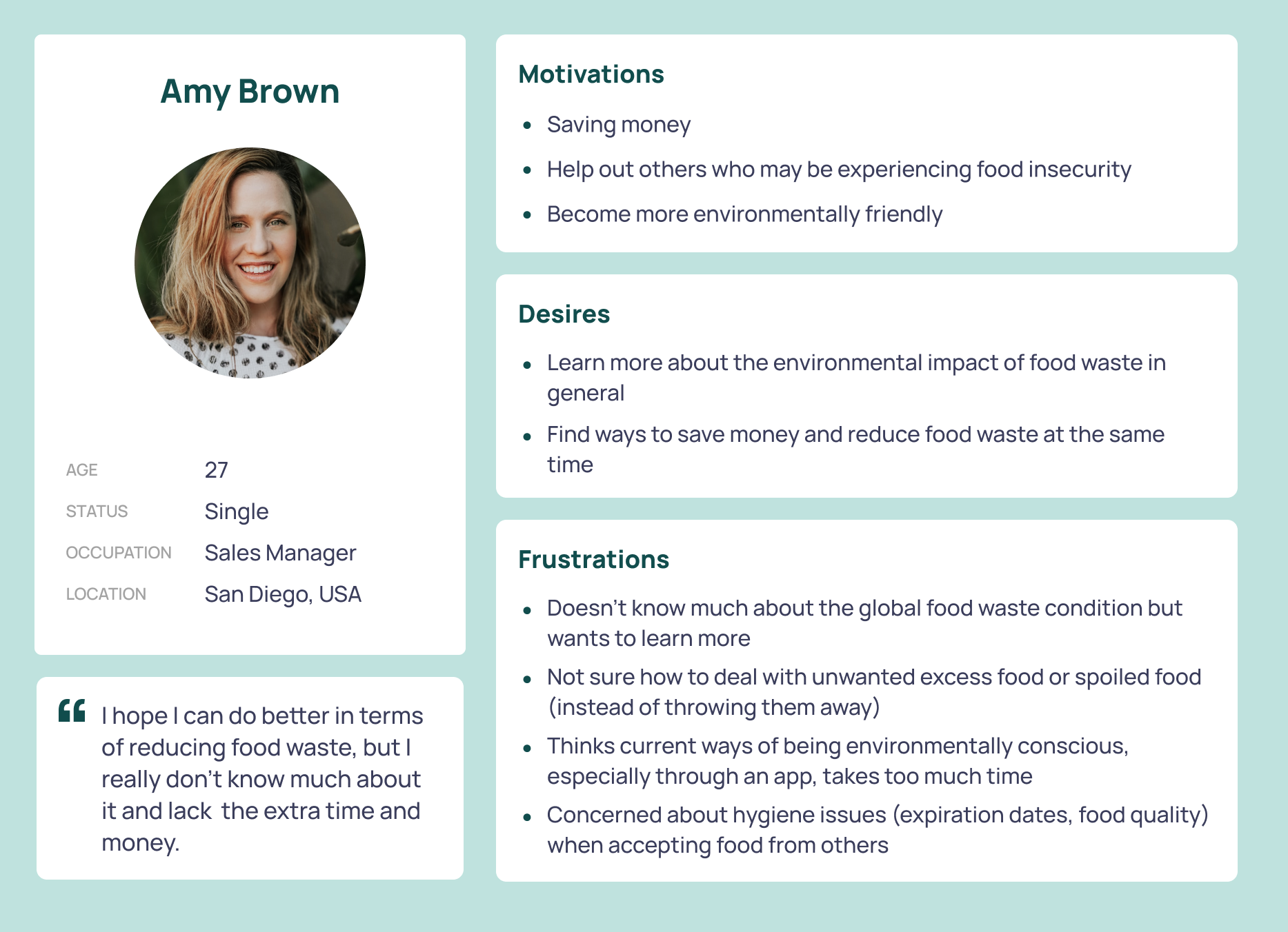
After conducting in-depth interviews, we identified two types of user groups and analyzed their motivations, desires and frustrations. The Primary user is Amy Brown which represents those who are new to help combating food waste and are not very informed about the topic. Our secondary persona are people like Brandon Davey who are actively fighters of food waste but would like to know and contribute more. We are keeping the needs and wants of both user groups in mind when designing.

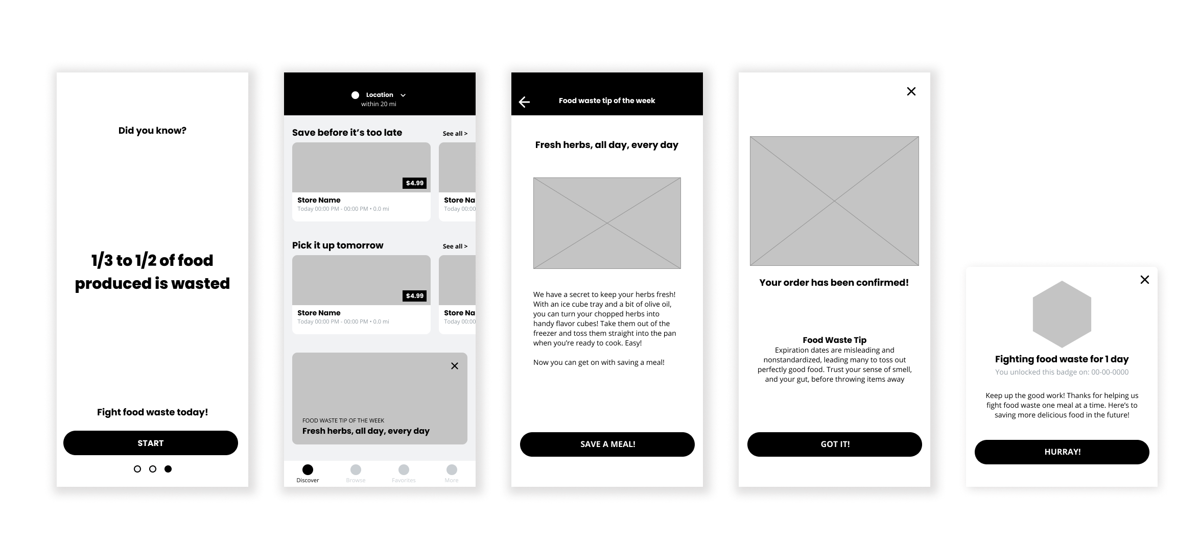
In order to test and iterate early on, we made low fidelity prototypes that don't distract users with engaging visuals so we can focus on testing the flow and redesign concept.
After conducting the intermediary process of storyboarding, sketching and wireframing, we curated low and high fidelity prototypes and conducted user testing for iteration. We noticed three major issues:


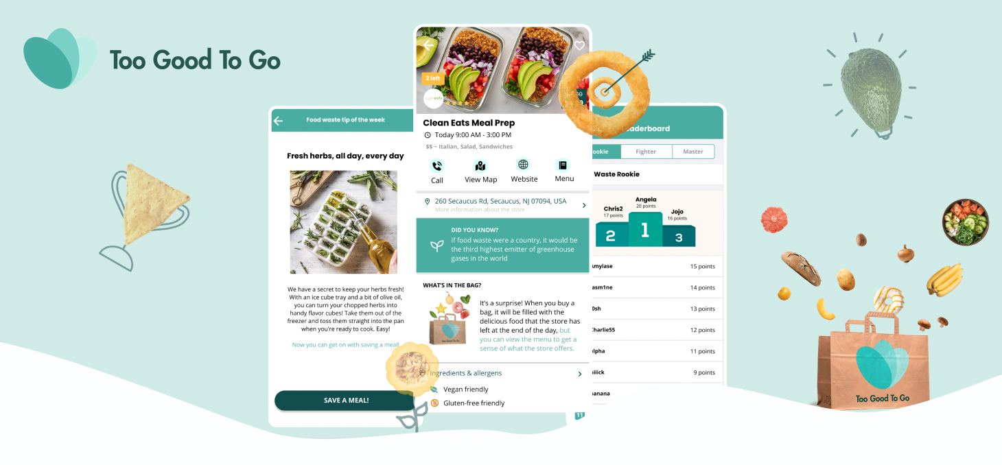
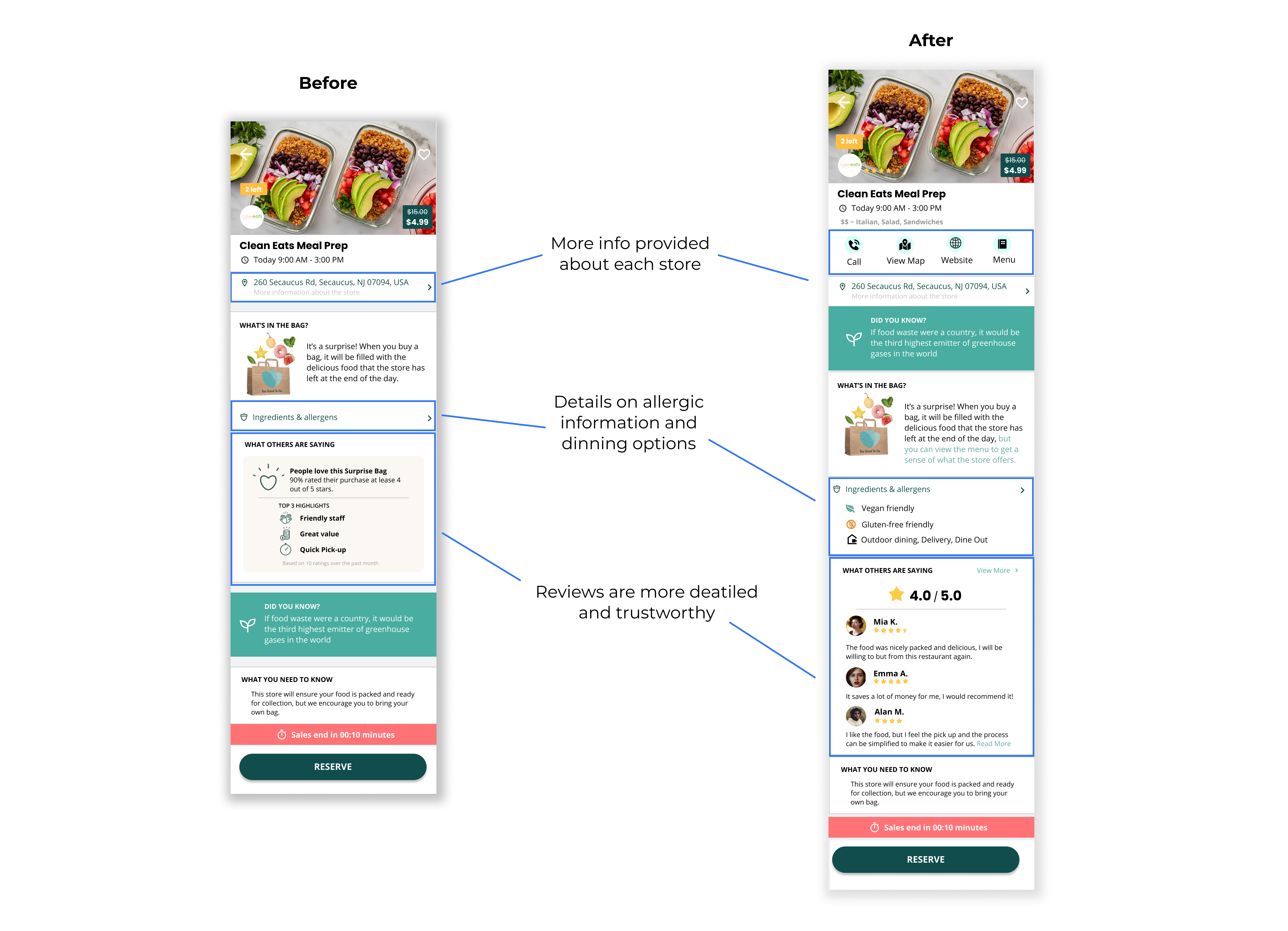
From user research and testing we found that many users are not very familiar with the app and are concerned about buying excess food from restaurants, especially when it comes to food quality, expiration dates and allergic information. After we are done with the group project, I personally redesigned the individual store page to add more information like phone number, website, menu, and detailed reviews to establish better trust between buyers and sellers. I believe the redesign can boost the incentive for users to buy on this app, thus achieving our goal of mitigating the food waste issue.
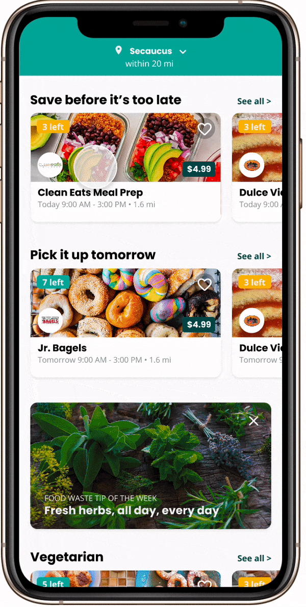
Food waste facts & Tips
Incorporate food waste facts and tips during the signup process, each restaurant’s page and the order confirmation page to educate users about global food waste issue and provide continued reinforcement of the topic.
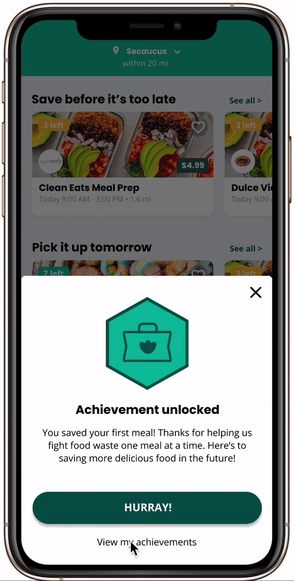
Badges & Leadership Board
Added Points, badges and leadership boards to help users keep track of their influence and encourage them to keep contributing
Detailed info about stores
Users can easily contact the store by calling, checking locations, visiting websites or the menu to quickly get a sense of what the restaurant offers. Allergic information and detailed real-time reviews are also provided for users to make better judgements.
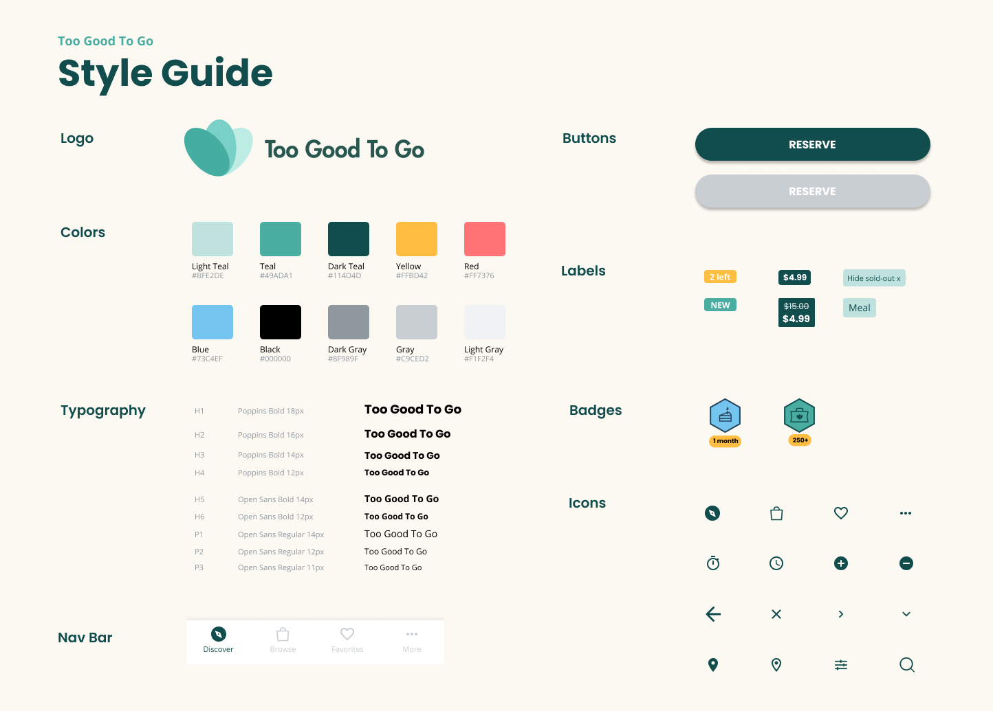
We decided to follow the design system of Too Good To Go since they already have a solid brand identity. I curated the style guideline below by extracting elements and colors from the official website and current mobile app.
1. Learn to make compromises
Initially, I promoted features such as adding search filters and chat channels. These ideas were not adopted since my teammates thought that they deviated from our problem scope. I decided to compromise with the team’s decision and took on personal effort to implement my idea after the group project ended. I learned that although advocating personal ideas is important, making concessions is unavoidable when working in teams.
2. Designing from users’ standpoint
At the beginning, we wanted to put food waste facts on each stage of the onboarding process which is quite distracting for users if they are trying to sign up quickly. From user testing and iterations, I realized that good designs need to incorporate the info that we want to present seamlessly into the flow, minimizing distractions for users.
.svg)