


Brushing Up on Brilliance...
Almost Ready!
Almost Ready!
Conduct user research
Analyze & Synthesize data
Sketch wireframes
Build prototypes
3 months
October 2020 - December 2020
Yumei Feng and Wenqing Xu

During the pandemic, millions of international students went back to their home countries taking online classes via Zoom. Different time zones, inefficient communication, and lack of self-discipline are all obstacles to academic and career success. We decided to target them as our user group and catering to their special need of having to watch recordings for classes and manually converting between time zones.
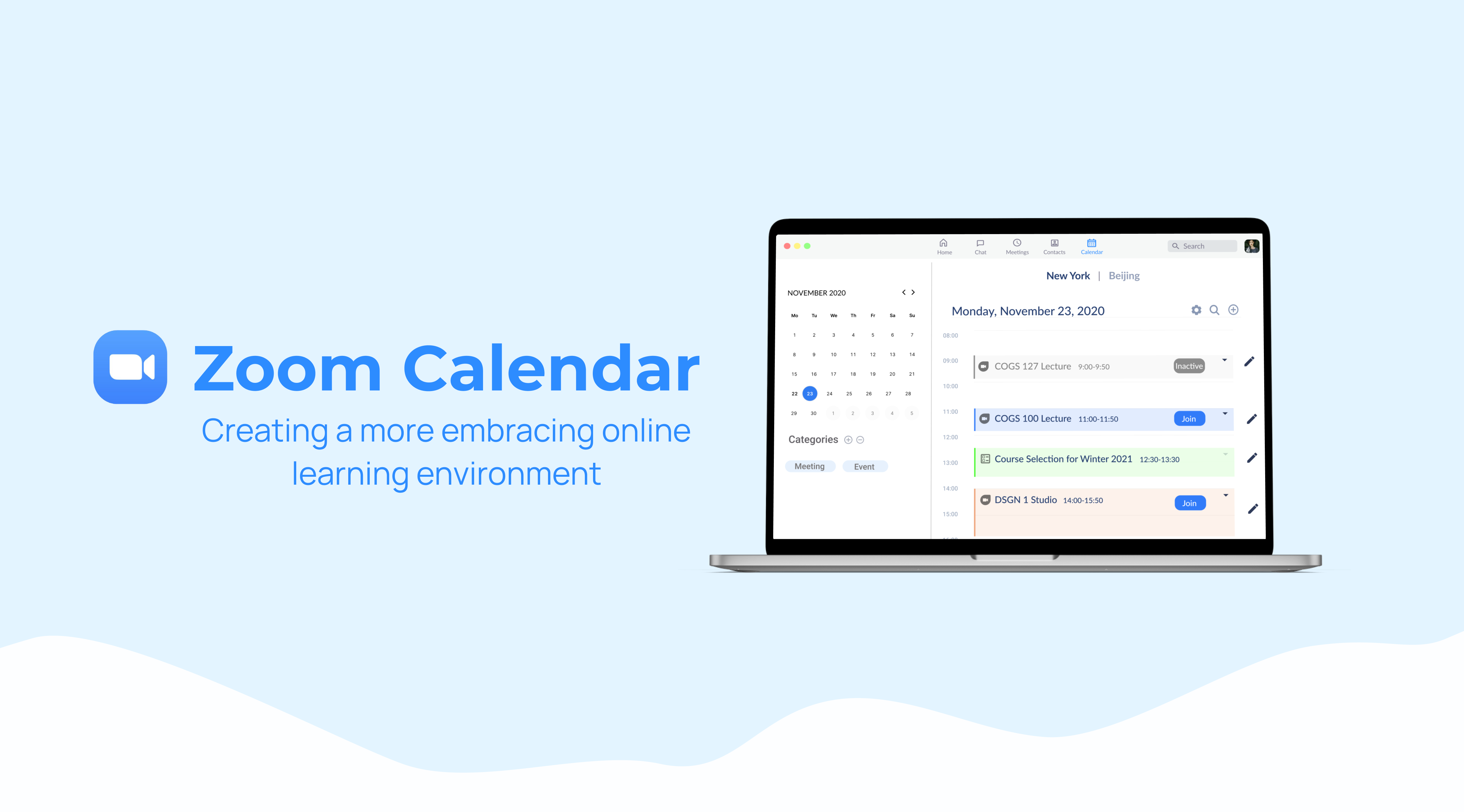
"To create a more embracing online learning environment for international students through simplifying the process of joining meetings in Zoom. "
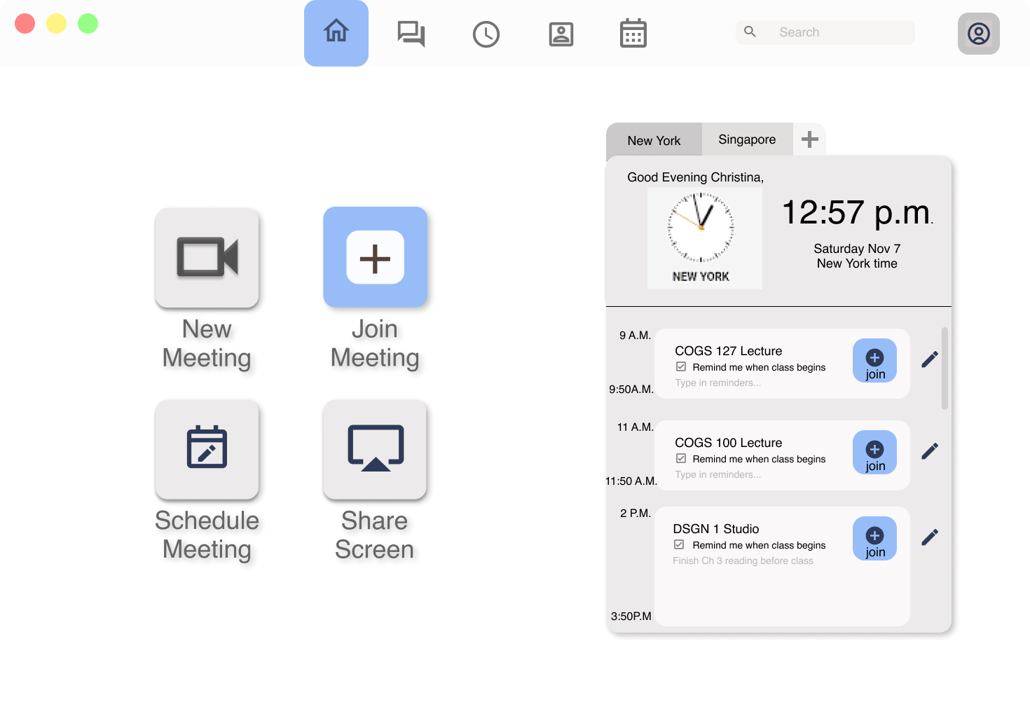
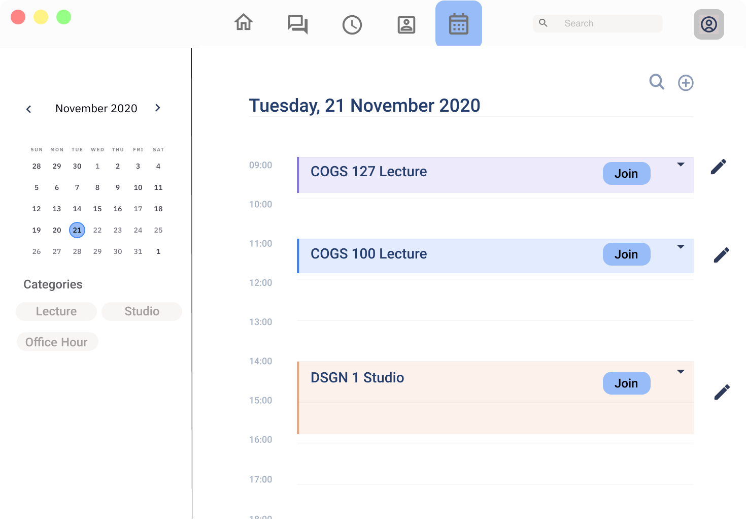
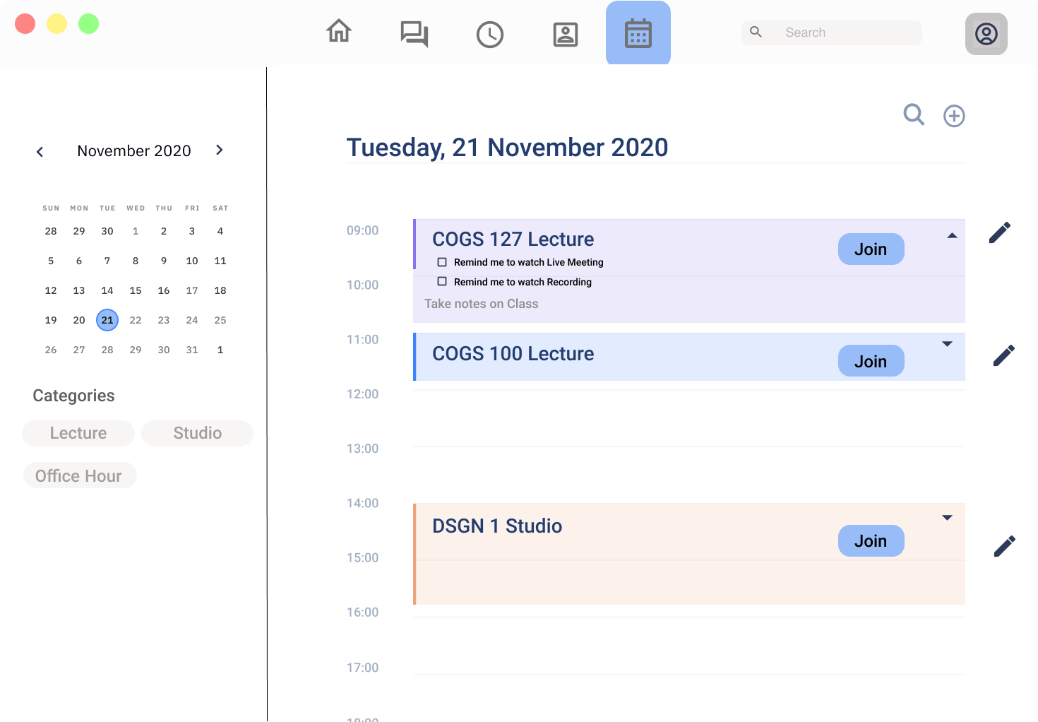
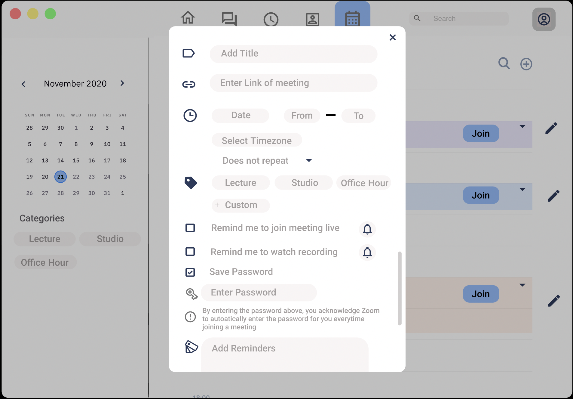
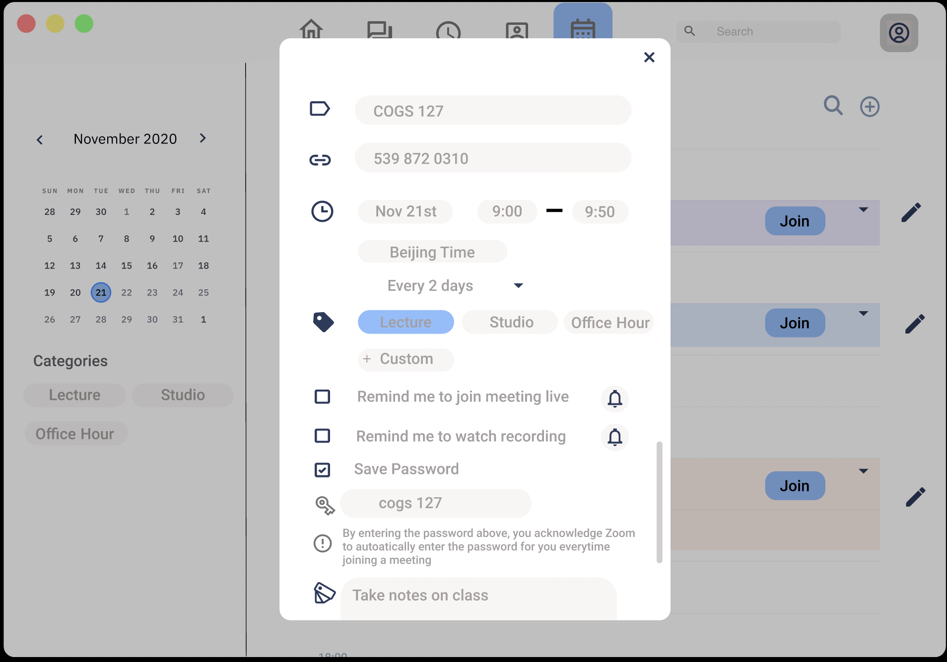
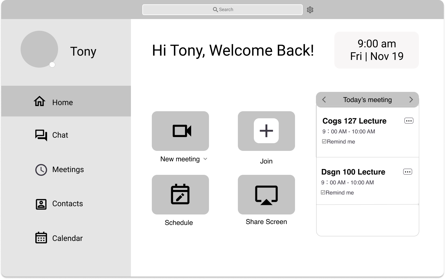
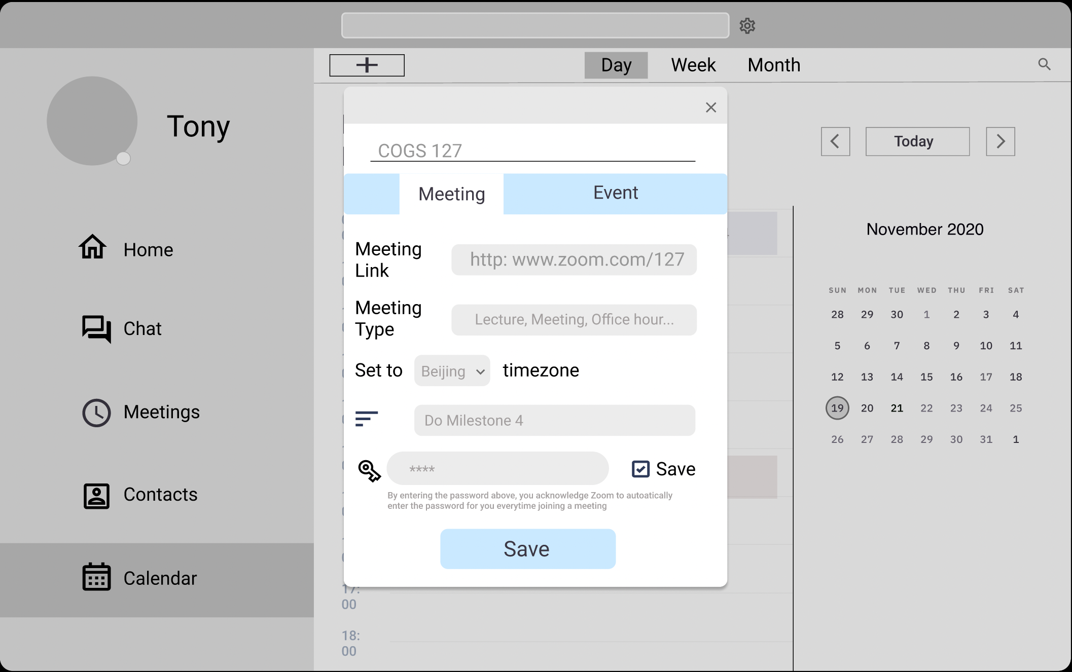
We added a Calendar section in which users can save time and links, set reminders and adjust time zones for recurring meeting. After saving the information, meetings can be joined with one simple click and we found that 90% of users think this is more helpful than Zoom's current version because it really saves time and energy.
Bearing in mind a business goal while making our redesign, we also focus on measuring the success of our apps while conducting user research and testing. We gathered the following results:

Reduction in join
meeting time

rise in user satisfaction

Positive feedback on time zone conversion feature


Barinstorming
Problem Statement
Survey
Interview
Competitive Analysis
Personas
UX Flow
UI sketches
Low Fidelity and high fidelity prototypes
Usability Testing Heuralistcic Evaluation
Feedback review
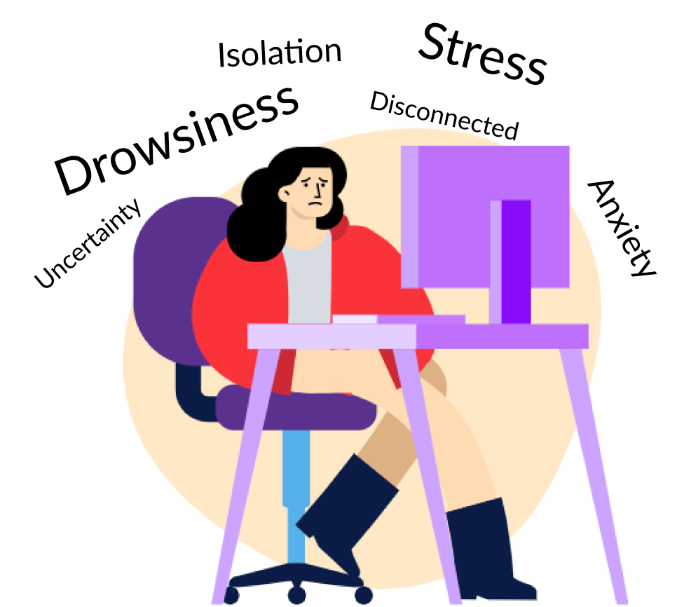
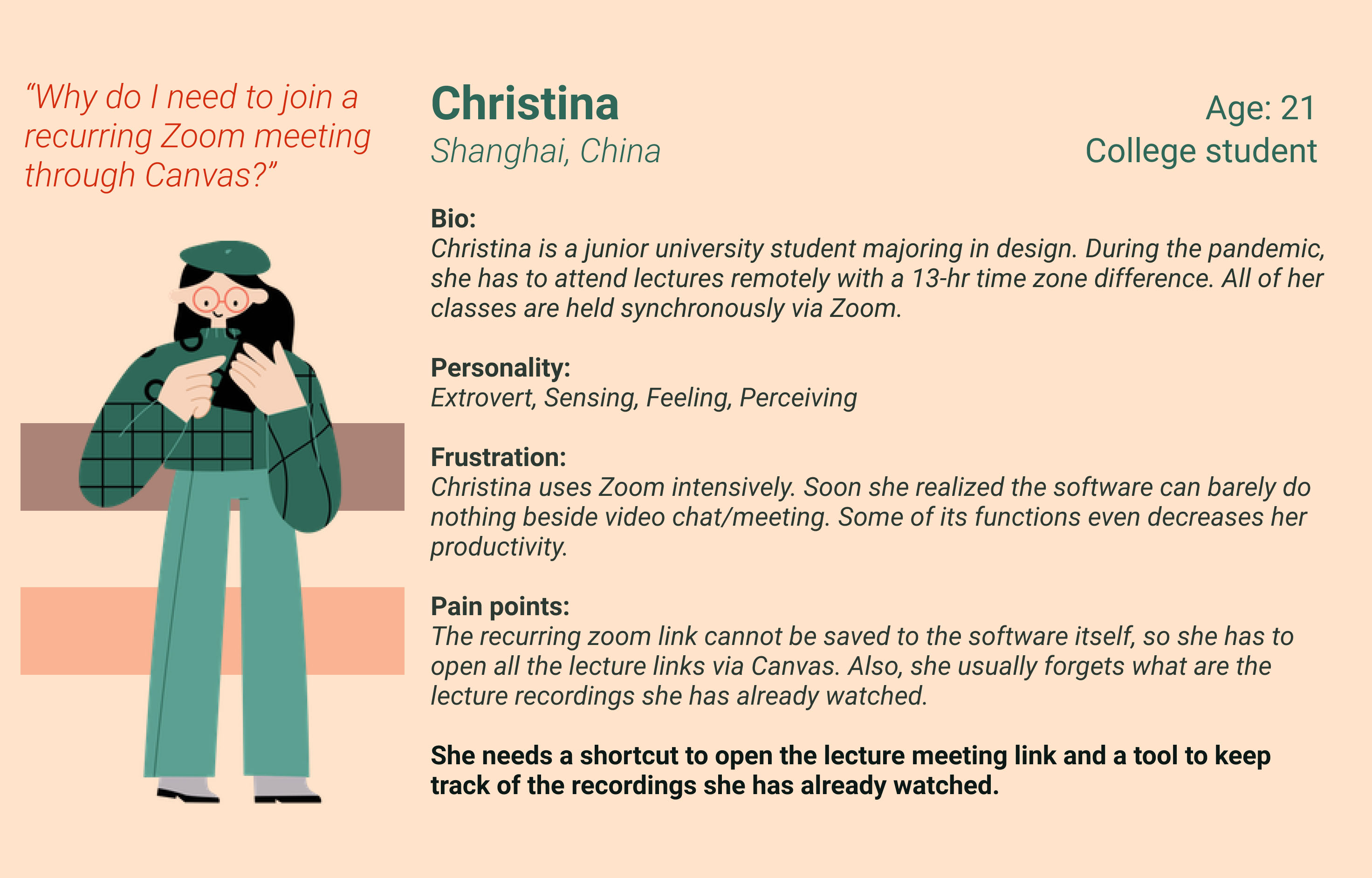
Imagine setting an alarm to wake up at 3 am for a class meeting, but realized that class won't start until one hour later since the time has just been switched to Daylight Saving time. Can you feel the sense of drowsiness and desperation? The experience of attending "Zoom University" is especially difficult for international students as scenarios like staying up all night for classes, remembering the wrong meeting time or forgetting to attend lectures because of time zone differences are happening to international students on a daily basis. I am one of them and that's my initial initiative on improving the user experience for international students by redesigning a commonly used platform.
To accommodate international students in China, the survey is made with Google Forms and Tencent survey since some international students can’t access Google Forms without a VPN. Surveys are distributed through several platforms commonly used by students: Piazza, Reddit, WeChat, and Instagram Posts. We received 12 responses from Google forms and 17 from Tencent survey.
Online Surveys
Interviews
Average rating of online classes
reports that remote learning greatly impacts their learning experiences
To get a deeper understanding of the problem, we interviewed 5 students taking classes remotely regarding details about their online learning experiences. We asked questions including:
How many classes are you currently taking?
What online video platforms are you using?
What struggles or difficulties have you experienced using video platforms?
What do you wish to improve in terms of user experience?

Tony - 21 years old- Junior UCSD Student
To better understand our problem space and gaining insights from existing products, we decide to compare different aspects of apps commonly used by students. We have a better understanding of how to improve Zoom after examining the functions and limitations of various commonly used communication apps. We gathered the following
Key insights:
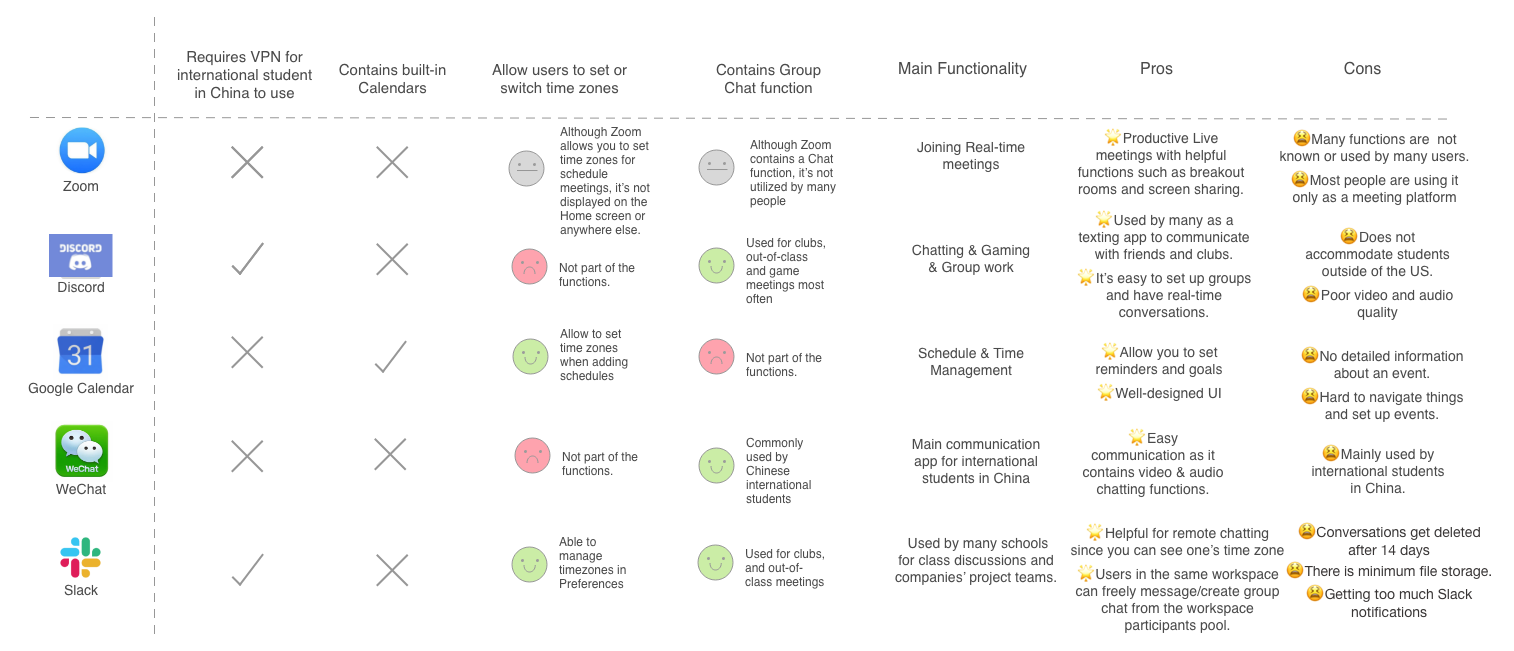
1. Time zone differences make students hard to keep track of the lecture time synchronously
67.6% of participants report that they need to put a lot of effort into manually converting times and alarming themselves to attend classes. However, no platform or function on any app is able to solve their inconveniences easily.
2. Does not have Zoom link history so students had to click on the link posted on canvas every single time
79.4% of participants reported that it's very time consuming and inconvenient to find Zoom links through other platforms every time before class starts. Users wish there's an easier way to access recurring meetings.
3. Hard to stay focused during the zoom lectures - “Zoom Fatigue”
55.9% of participants have reported that they feel hard to concentrate while attending a zoom lecture. Though this might not be Zoom’s problem, the phenomenon indicates that the corresponding apps can make adjustments.
After gaining insights from user research, we have a clearer understanding about the needs of our users. We decided to create two distinct user personas for orienting our design and facilitating a more realistic view of our target user group.

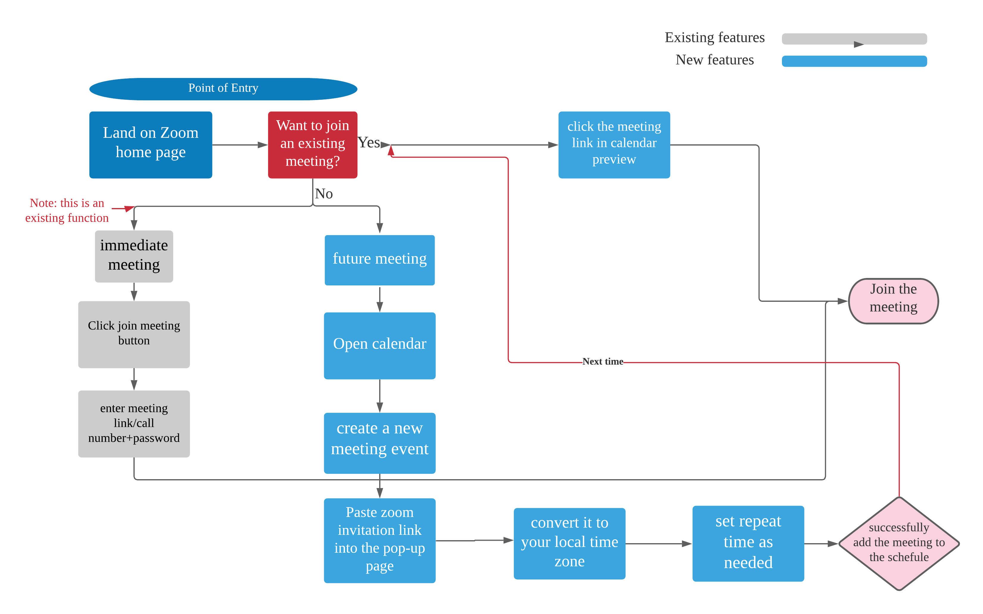
To create a more seamless user experience, we created a complete and a more detailed flow illustrating the unique built-in functions of the calendar. We highlighted the entries, exits and decision points that users would interact with to orient our design decisions.
User flow 1 illustrates the complete process of landing on the HomePage, navigating to the Calendar Page, and joining meetings through the "Join" button. It caters towards international students as we design the "Set to local time" button.
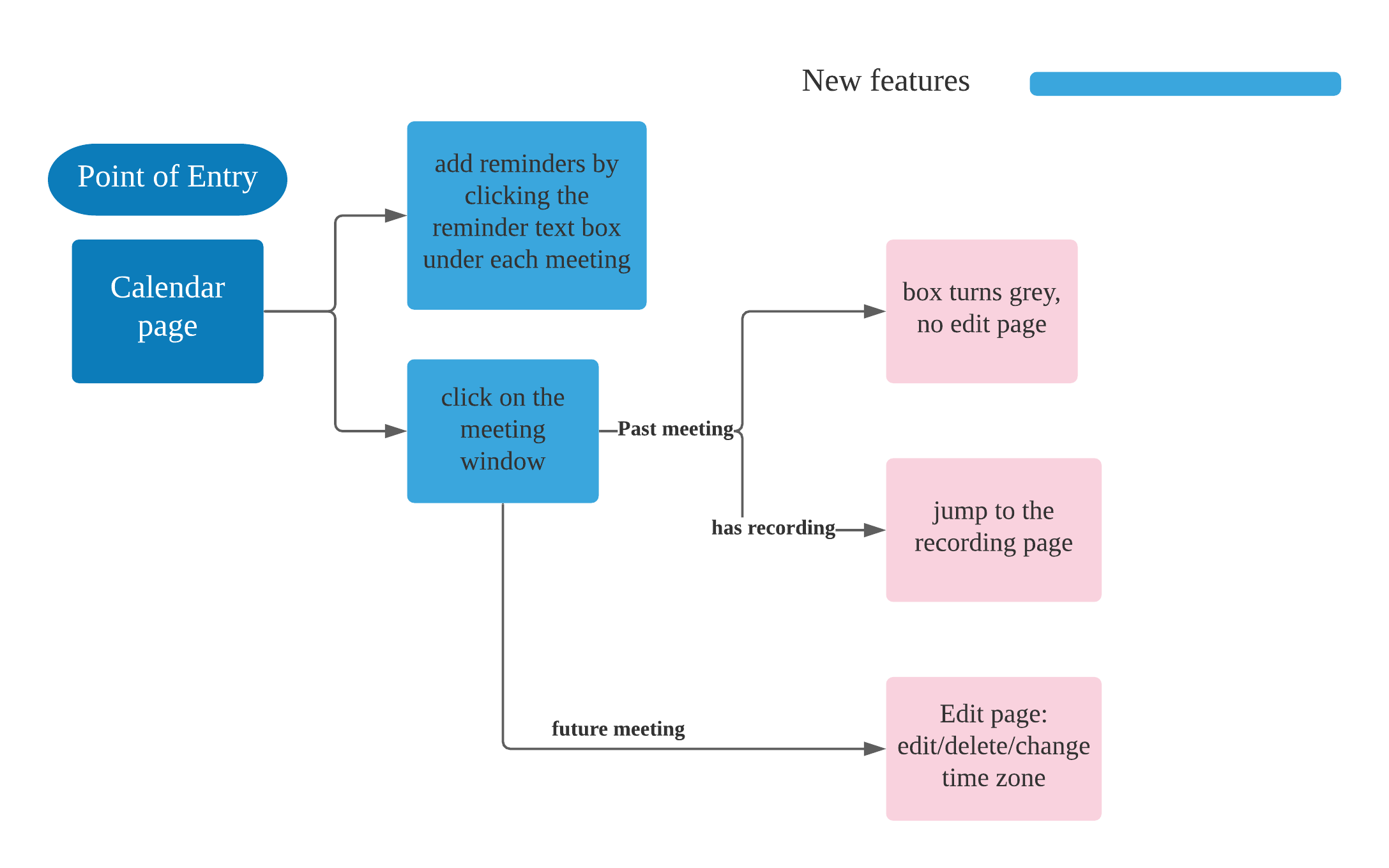
Flow Chart 2 focuses on how users would navigate around the Calendar page. Users are able to add and edit reminders and set alarms for them. This function was designed to be obvious so that students can better remember to watch the lecture recording or complete after-class homework.
Me and my partner took slightly different approaches by focusing on different aspects but we both use the user flow as the framework for drawing UI sketches and made two distinct versions to compare for better alternatives.


Before investing all the time and effort into making final prototypes, we decide to make a low fidelity version that focuses on testing the functionality instead of the aesthetics. As we took the approach a bit differently, we made Prototype A and B separately test out for better alternatives.

Highlights of Prototype B
.png)
.png)
.png)

Mythology
We invited 5 participants to test our low fidelity prototype by sharing their screen while navigating through the prototypes. We first let the users freely explore the prototype on their own, then ask them to complete tasks including navigating to the Calendar Page, add and edit meetings, and find the checkbox for setting reminders. Through observing the users’ actions, we were able to see if there are any confusions or logic flaws to our prototype. After accomplishing the task, the participants were asked a set of questions including their general thoughts on the prototypes, preferences, and further suggestions.
Testing Results

Too much info clustered on the add/edit meeting window
No clear instruction for the set reminder box

Lack of instruction
Prefer checkbox instead of drop down bar
Key Insights
From the testing results, we found out that participants like and dislike certain parts of each prototype so features of Prototype A and B should be combined to create a better user experience. We incorporate the suggestions into making our high-fidelity prototype.
After making our high-fidelity prototypes, we conducted a second round of user testing in regards to the aesthetics and functionality of the prototype. We received a lot of positive feedbacks and suggestions for improvements.
Refining the details of meeting blocks
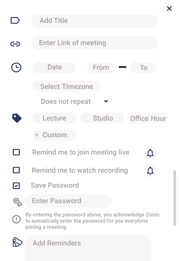
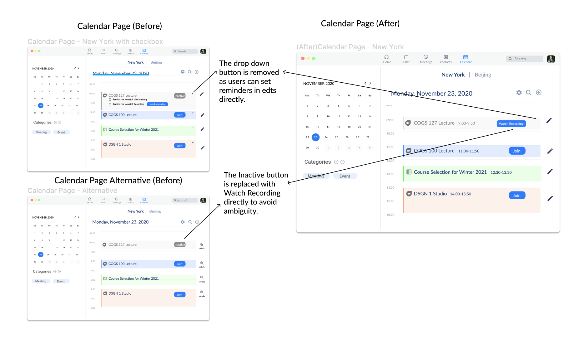
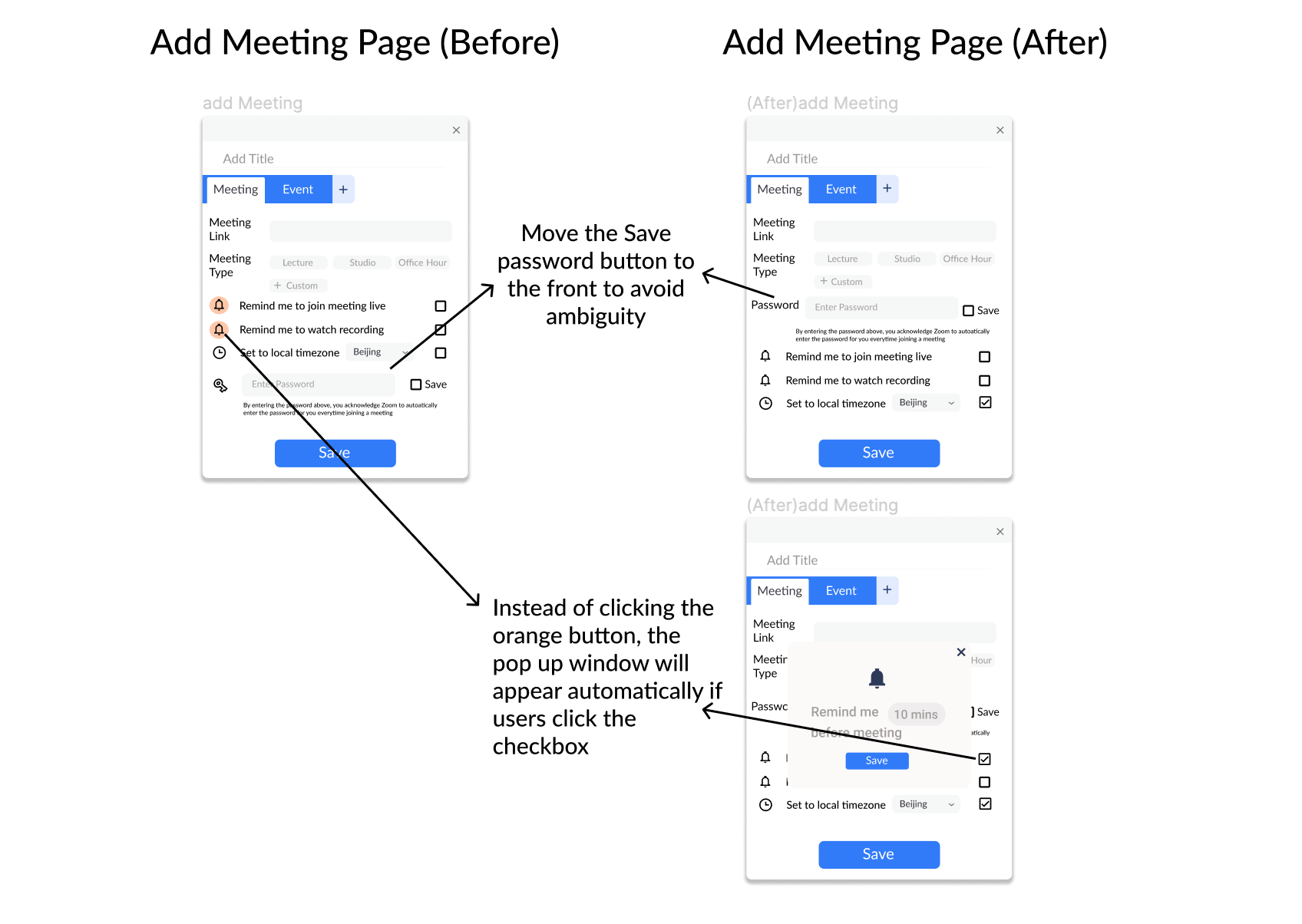
The first story focuses on refining and the meeting blocks on the calendar page as many interviewees reported that the "Inactive" button can be ambiguous and the drop-down panel might be unnecessary.
Easier to add meetings
Story 2 focuses on solving the unclarity of the reminder button interaction in add and edit meeting.
Easier navigation for Home Page
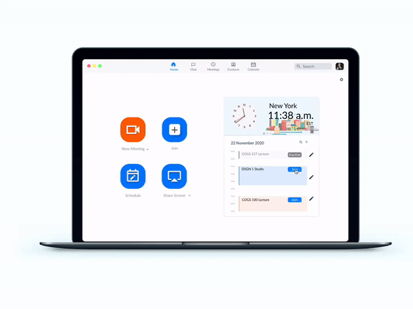
Through user research, we found that many interviewees think that the current Zoom HomePage UI is too plain and some of the buttons are useless. Based on the results from user testing, we decided to combine the two designs of Home Page together and polish them to achieve the maximum balance of beauty and functionality.
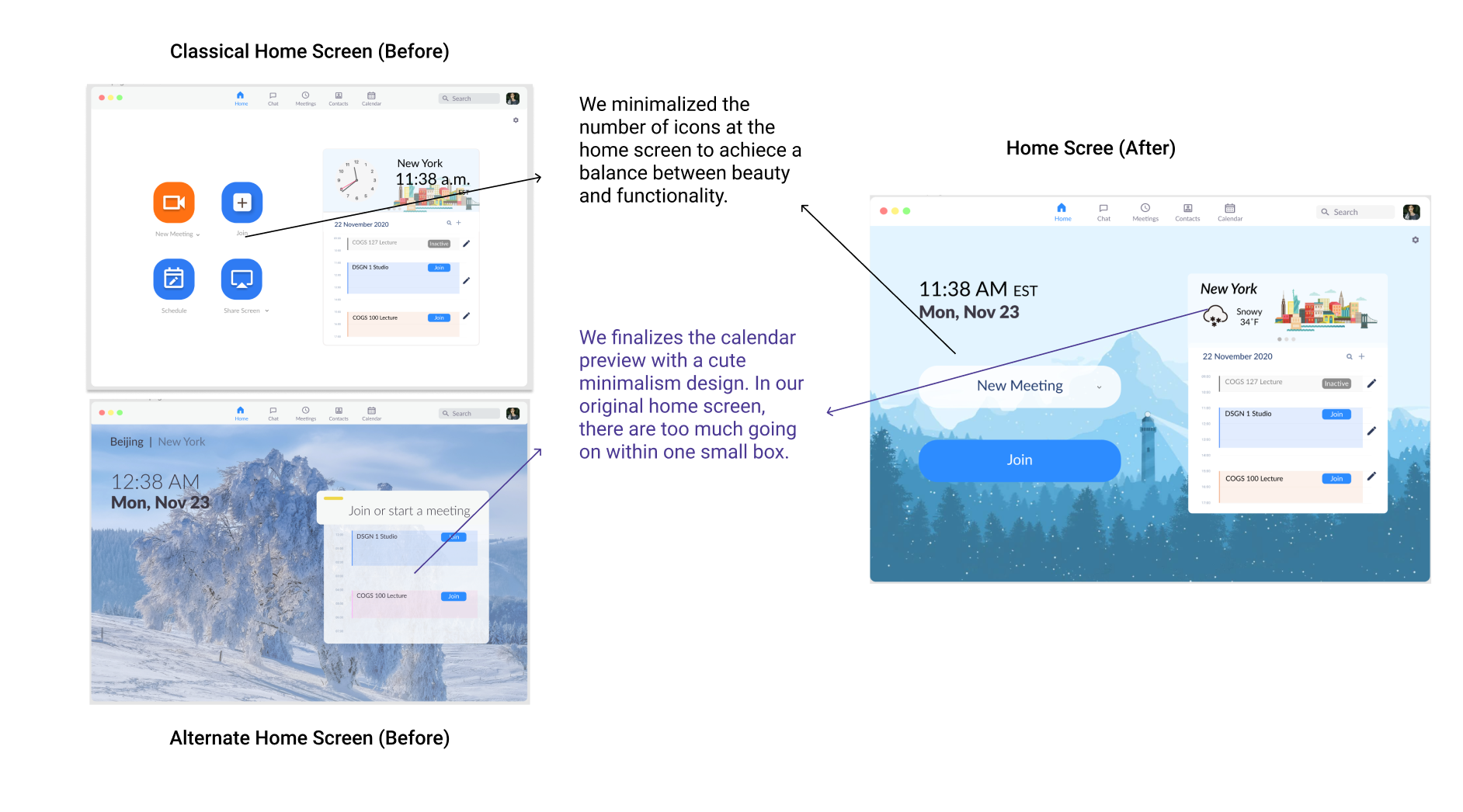
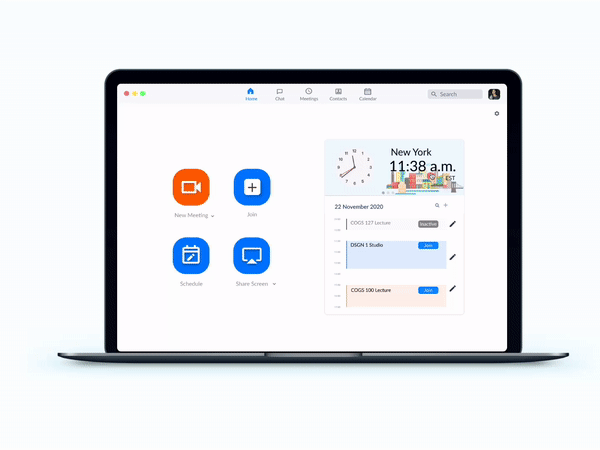
Join meetings with one click
Users can join recurring meetings directly from the Home Page Preview Window or the Calendar Page without navigating to other websites or manually entering meeting IDs.
Save/edit meetings or events
Users are able to add meetings or events from the Calendar Page and set reminders by clicking the edit logo.
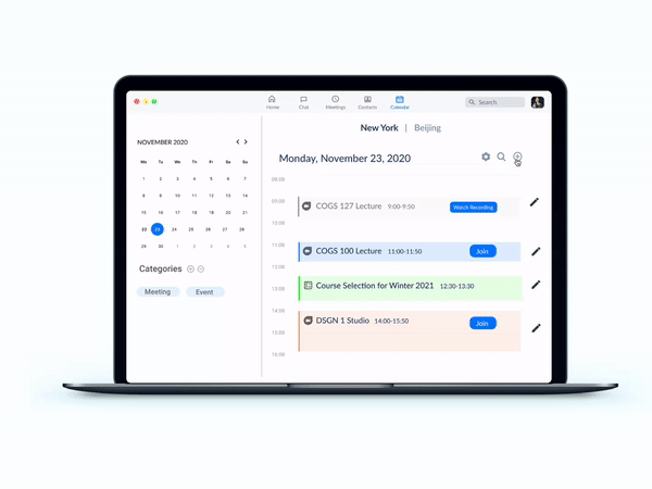
Organize schedules by categories
Users are able to manage their schedule into Meetings and Events, or a custom category of their choice.
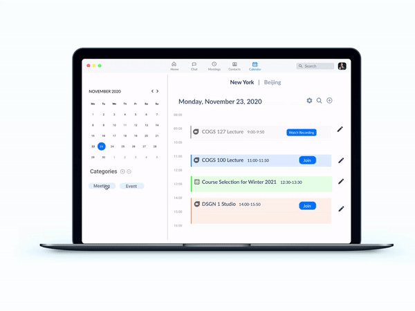
Switch between Time Zones
Easily switch between time zones on both the Home Page and the Calendar Page with one simple click.

1. User Testing is the key
I realize that conduct testing with real users is the key to success for a product. It allows us to identify flaws and breakpoints early and make fast changes which avoids spending tons of time on unsatisfying features.
2. Never afraid of trying alternatives
Me and my partner have diverging interpretations so we made various prototypes to illustrate our thoughts separately and then communicate with each other. The making and testing of different versions of prototypes with users help us to compare for better alternatives.
3. There's no such things as a "Perfect Product"
Products needs to be constantly updated according to user and market feedbacks so we will keep refining and polishing our designs to aim for better user experiences.
In the future,
We plan to expand our target user group to include not only international students, but also the general student body, business, and individual users that utilize Zoom on a daily basis. Our plan for the next step would be refining the interactions in our final prototype and adding more features to the calendar to accommodate more user groups.

.svg)