
Almost Ready!

A mobile interaction checker leveraging deep learning to predict drug and food interactions, empowering and educating users on multi-drug use.

User Research
Product Design
Interaction Design
3 months
June 2022 - Sep 2022
Figma, UserZoom, Google Suites
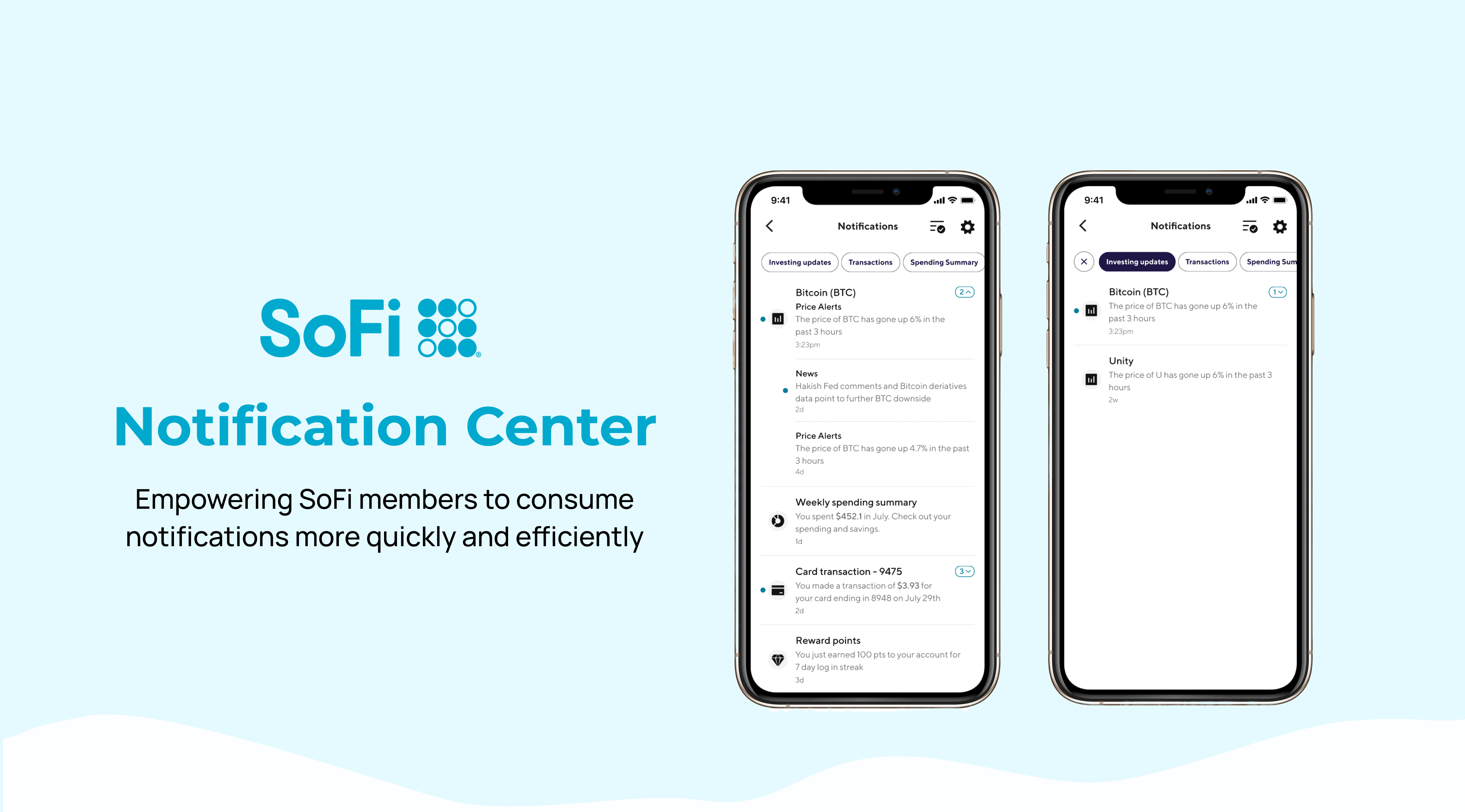
SoFi is a Fintech company based in San Francisco, California with a mission to “help people reach financial independence to realize their ambitions”. We are a member-centric company with over 400 million members, and 10+ financial products spanning from banking, lending, insurance, to invest.
A large part of SoFi’s 2023 initiative is to revamp the communication experience to allow our members better stay connected with their accounts and SoFi. Over the 12 weeks internship, I worked on redesigning the “Notification Center” to envision the North Star experience for the next-generation SoFi app.
I took the lead through every process including product ideation, and design decisions, and collaborated with different partners including PM, Business leads, UXRs, and engineers. I routinely sourced feedback from stakeholders and my design team to ensure project feasibility and success.

1. Complete the end-to-end design process for redesigning the consumption surface of the Notification Center
2. Collaborate and communicate closely with design manager, PMs, Business leads and engineers within the team.
3. Spearheaded user research by drafting research plans, and conducted 6 member interviews and 40+ members focus groups.

The Notification center is an important place for members to receive news and updates. However, the current experience is suboptimal because of confusing navigation, poor organization and improper links.

I redesigned the Notification Center with better organization of content and a less cluttered interface, allowing our members to perform actions directly and digest notifications with ease.
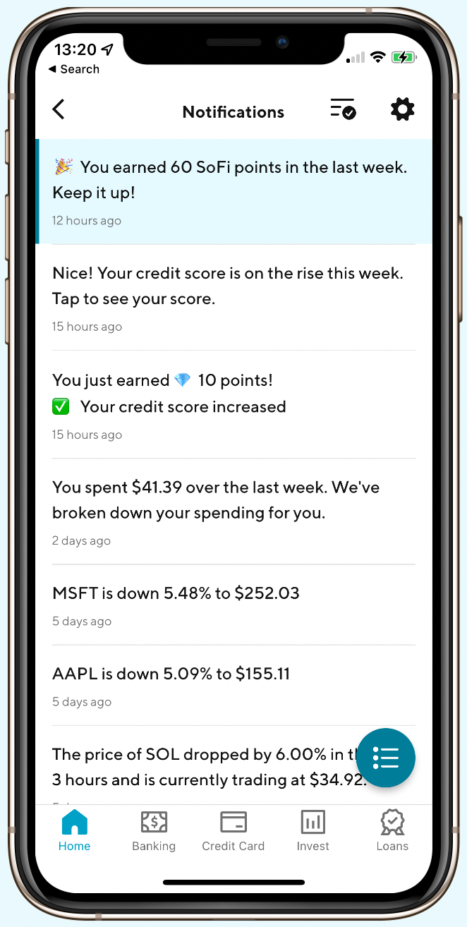
The current Notification Center
After my redesign


The redesign is expected to launch in Q1 of 2023 but the results from user testing is promising.

with major flow

NPS score

recommendation rate
To become the next-generation financial service company, a large part of SoFi’s 2023 goal is to provide a better communication experience to members and my project is an integral part of the initiative. While there are many parts to the Notification experience, my focus is mainly on the in-app Notification center consumption experience.


I worked under a tight timeline to accomplish the project during my internship. I had regular check-ins with my manager and 7 formal design criqtiue sections with the project and design leadership team.

To understand the problem in depth, I conducted both primary and secondary research to mapout user pain points and areas of improvement.
In app aduit & Data Analysis graphs
Competitor analysis
App reviews read
Userzoom surveys
I first analyzed the current flow of the Notification Center in our app and on desktop. 4 key problems are identified for both:
The current flow causes confusion and frustrations due to the discrepancy between desired route and actual route
Different types of notifications are mixed up together and there’s no emphasis of important content.
The use of Emoji is inconsistent and makes the text hard to read
Problems like incorrect linking and duplicative notifications are impacting user experience.

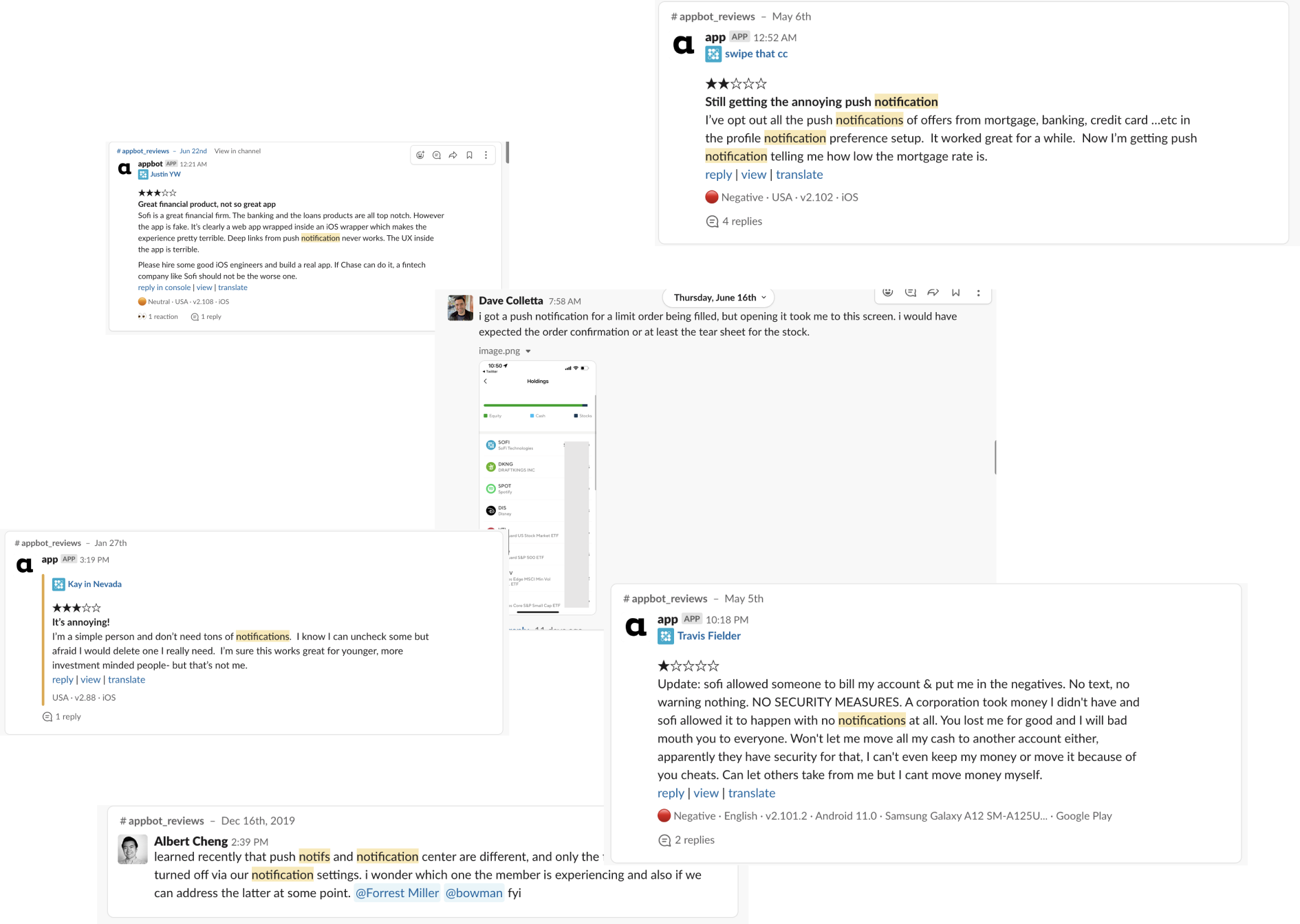
From reading the app reviews, I realize that our current Notification Center is not optimal. While a lot of them are engineering problems, I documented these findings and reported to the project team.
Deep links are not always reliable and notifiations are still sent even it's turned off.
Too many irrelevant notifications are sent and it's bothersome.
Transactions are not alerted or delayed
I analyzed the Notification Center of 15 apps including traditional banks, NeoBank, Investment, and social media apps to learn about their approach and synthesized it into the following table. I found that different apps incorporates different functionalities based on the purpose of the app, thus it’s most essential for us to consider the most viable solution and best thing for our members.

Key insights:

As I wasn’t able to get inputs from SoFi members directly at the moment because of research resource constraints, I conducted 3 unmoderated survey study on UserZoom to learn about general Fintech users' preferences regarding notifications and their consumption experience with other apps.
First one on general preferences, the other two on consumption experience
2 sections with 100 participants each and 1 detailed study with 15 participants
both quantative and qualitative questions about notification experience
Key insights:
Since grouping is the No.1 priority listed on the PRD, I first have to figure out how to group notifications before starting to design. I found the current way of grouping by product is inconsistent with our core company strategy and proposed a new direction:
The current approach of grouping by product is too business centric and over generalized, grouping by functionality and context will help members navigate through the content more easily by establishing relevancy.
I did a card sorting tests with members and stakeholders to figure out the most reasonable way of grouping. This is one of the most challenging part of the project since I have to consider the unification across all SoFi products.

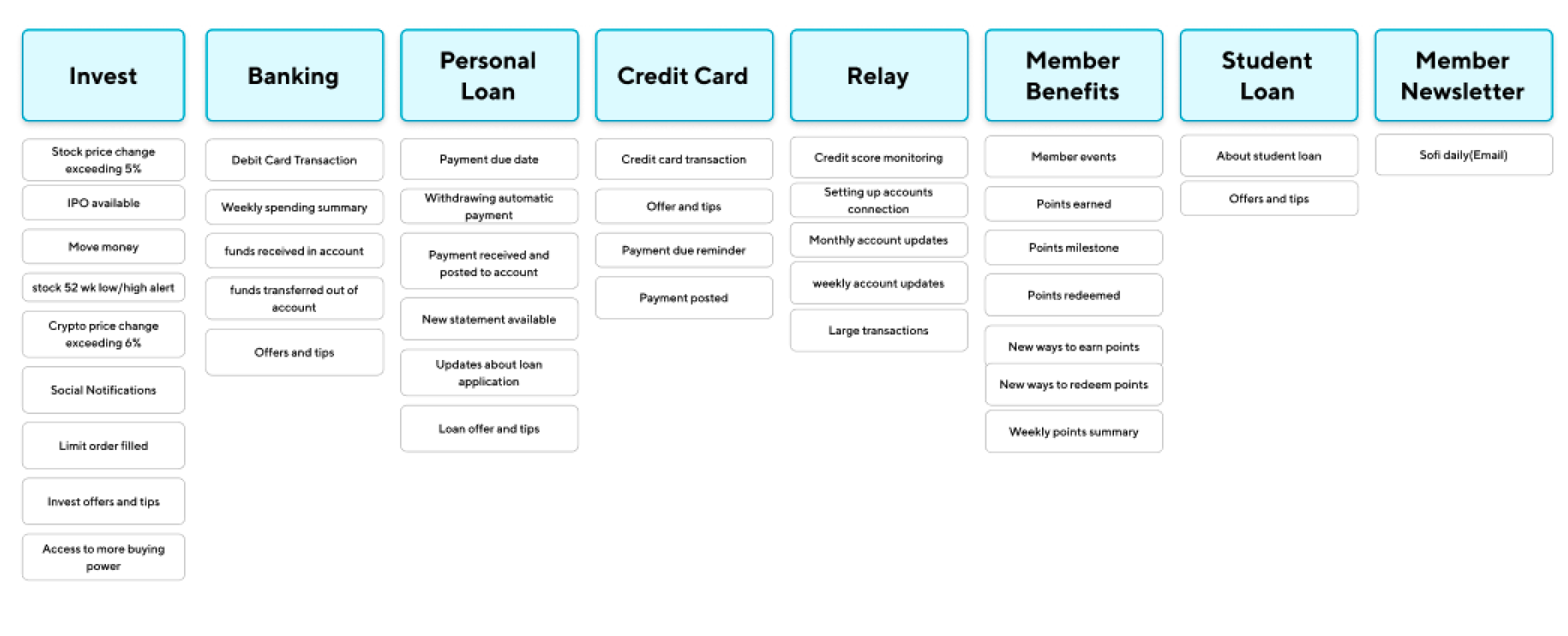

The main categories are then broken into sub-categories which are used as the subtitle for the thread.
Click to see each subcategory:
I first started with low fidelity prototyping in order to reduce visual distraction and and iterate quickly. I brainstormed various ways of grouping, threading, and filtering. I synthesized possible solutions into version A & B which adopted different approach for grouping.
This direction focuses on grouping notifications by a similar context, which can then be expanded in a thread view.

This direction focuses on having each card as an individual notification but grouped by date with a filter to sort content, and a focused detail view.

I interviewed 6 SoFi members and held a focus group with an additional 40+ SoFi members who are part of the advisory board. I worked with several user researchers at our company to prepare a comprehensive guide for both events. Both versions of prototypes are showed alternatively and members are asked to complete a set of tasks. Upon completing the tasks, I asked which prototype they prefer and their reasoning.

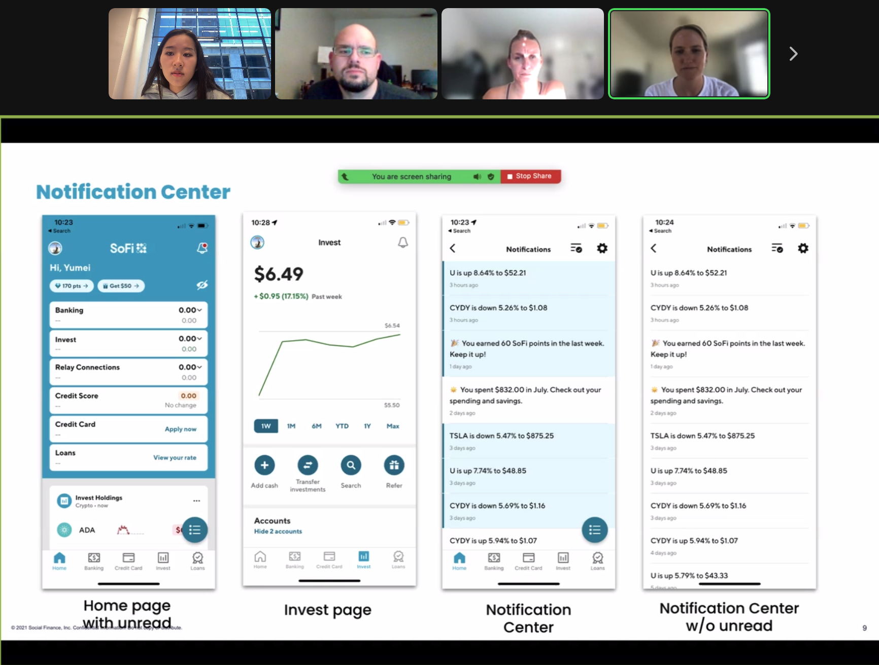
Key insights:
Combining benefits from previous versions, I focused on simplifying the flow, presenting information clearly, and taking into account design system guideline for my new iterations.
Upon finalizing the design after many iterations, I drafted an unmoderated user testing section on UserZoom. Out of the 15 participants, no one has problems with the major flow. Most complaints are about not able to delete notifications and the main reason might be testing a mobile prototype on desktop is not intuitive.
The study was done with 15 non-SoFi members on Userzoom
Complete tasks and questions comparing between designs
Out of the 15 testers, 14 are promoters with 1 passive

Synthesizing feedback from concept testing and user testing, I made a set of changes to my design. Now I have more confidence to say that all my design decisions are backed up by research.
Since members are often intimidated by the number of unread notifications, I decided to keep the simple red dot to indicate the unread status.


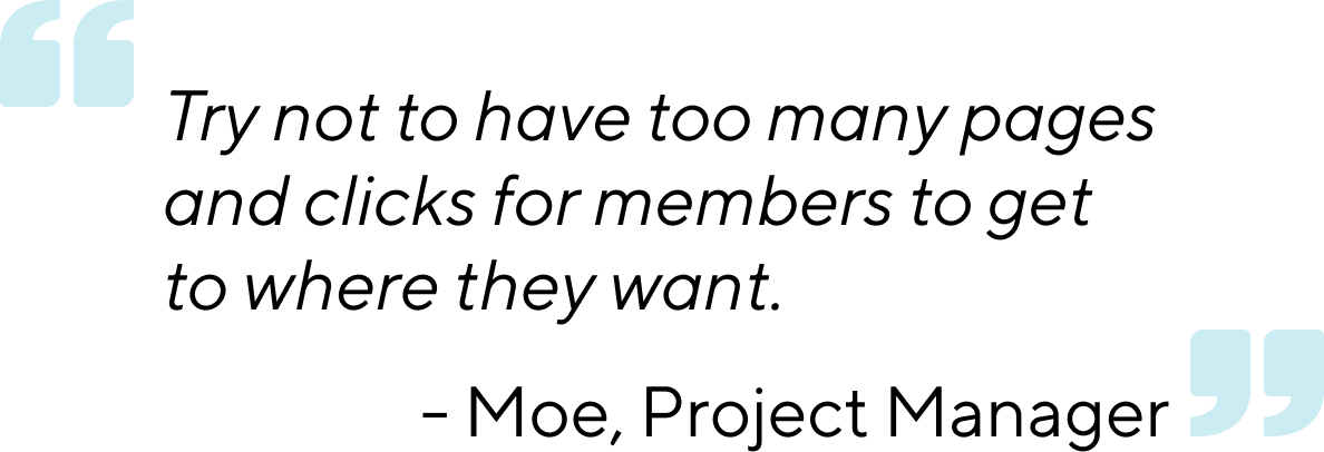
To avoid information overload and make the experience more efficient, I simplified the flow and reduced the number of clicks that users have to take to see details.

Based on user feedback, I decided to keep the mark all as read button and designed various ways for users to delete comments.


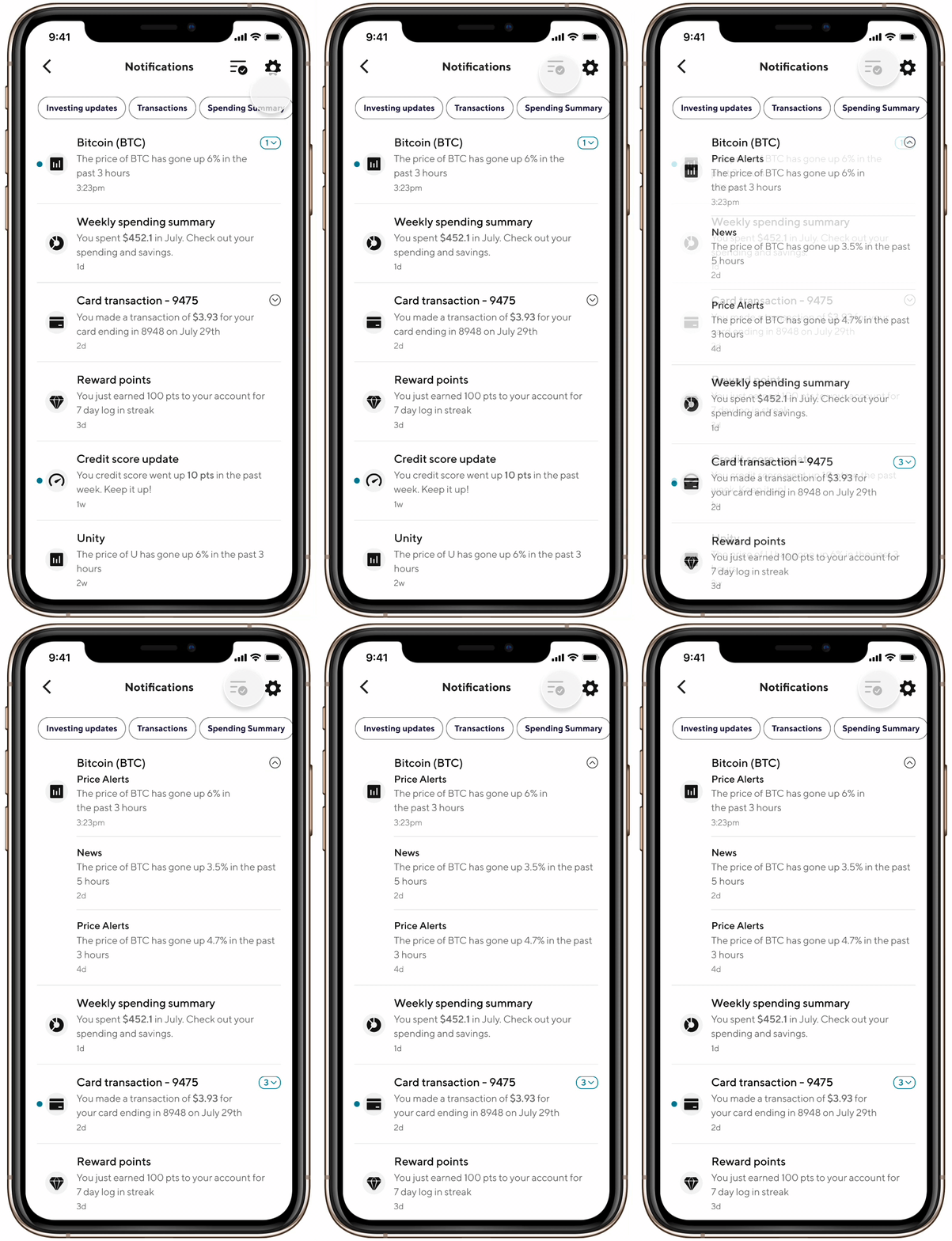
Threading relevant content
Relevant notifications will be grouped by context and threaded together. A thread can be expanded or collapsed upon tap.
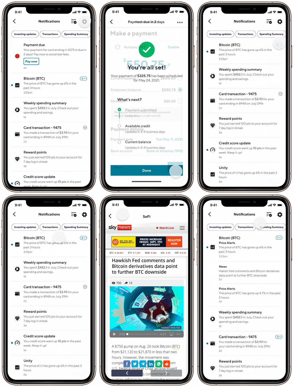
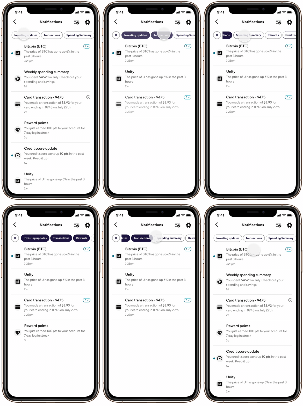
Filter notifications by category
Notifications can be filtered by category, which allows members to digest the content more quickly and efficient.
Mark all as read
Members can read through all the important content and mark all other notifications as read with one tap.
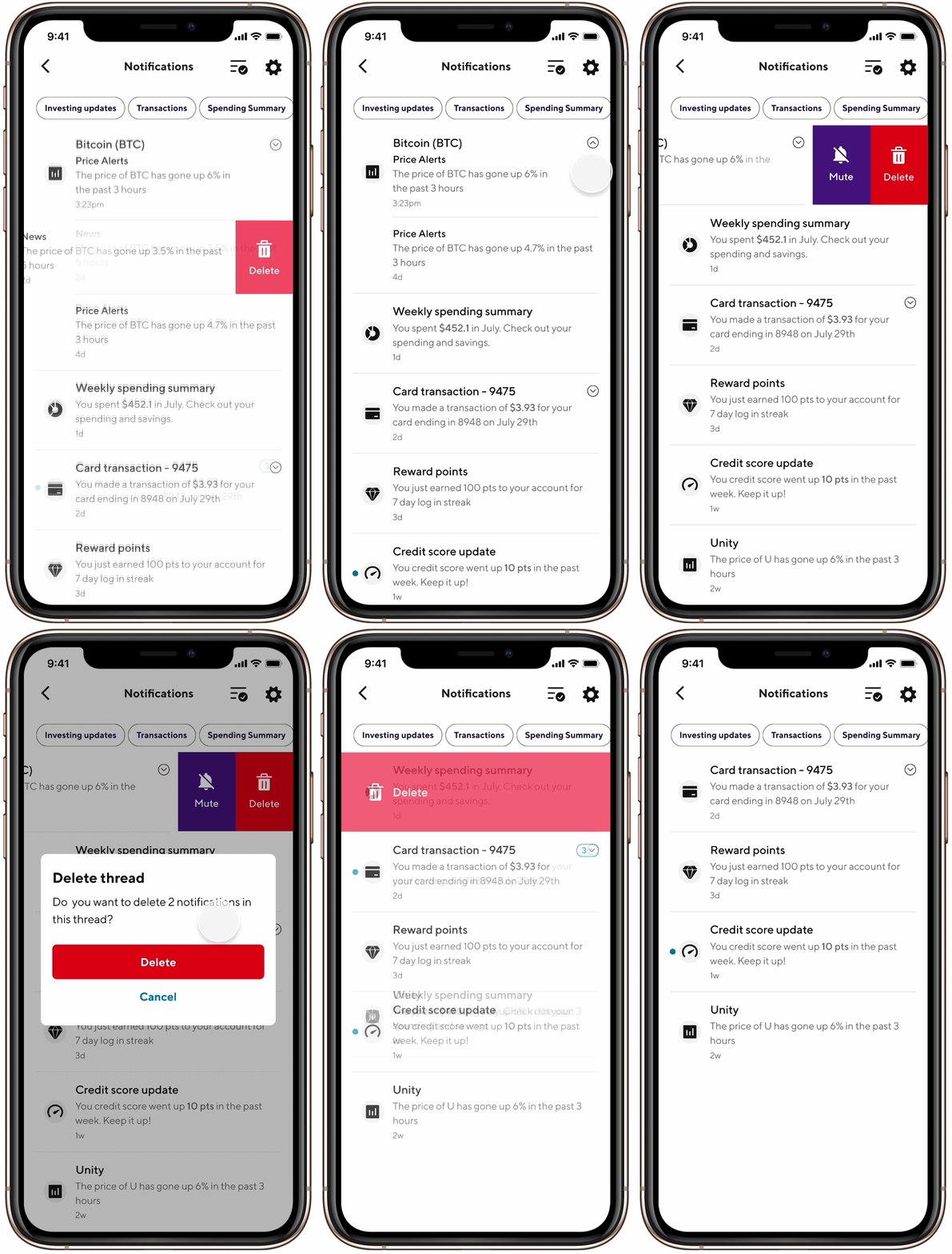
Delete or mute with ease
Users can hide all comments if they feel interrupted and extra content in the list are folded to avoid information overload.
Although I have considered desktop throughout my process, I realized that the interaction patterns on mobile and desktop can be quite different. I added an intermediate window for desktop when users are on a different product page and click the notification bell so it won't interrupt the major flow. I also added horizontal scroll buttons for filters since dragging is not intuitive on desktop.

Intermediate window
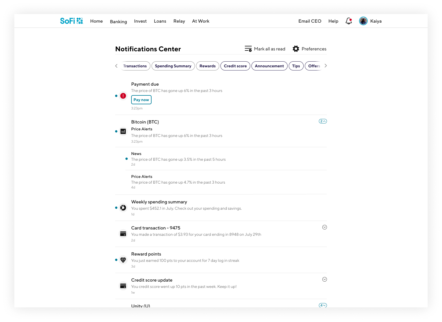
Thread expanded
We set forth a gradual development and release plan for the feature. Showing notifications up to 30 days has already been fixed in Q3 of 2022, notification grouping has an unexpected release date of Q4 2022, and all features are expected to be implemented in Q1 2023. The below graphics details the criteria used to measure success:


