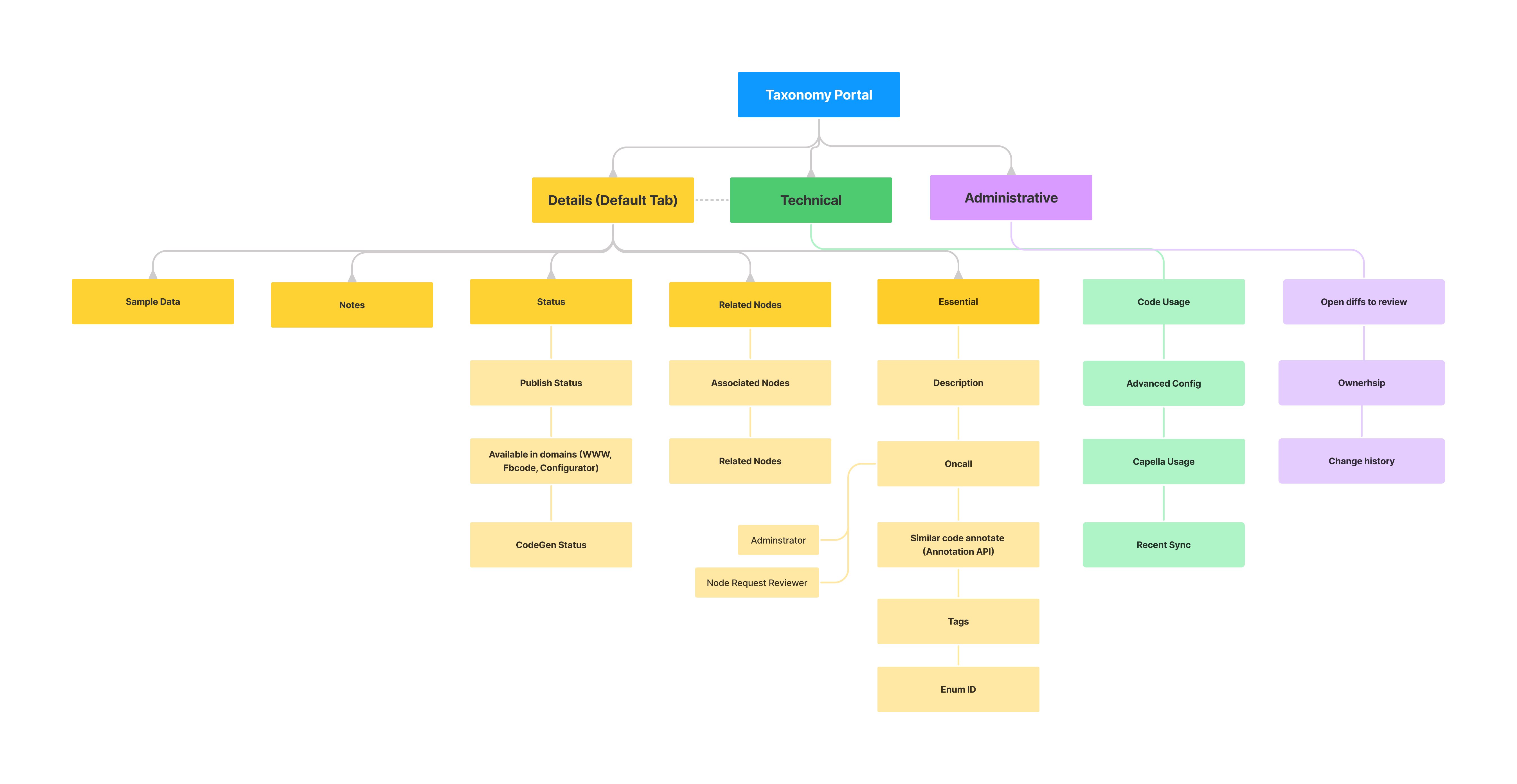
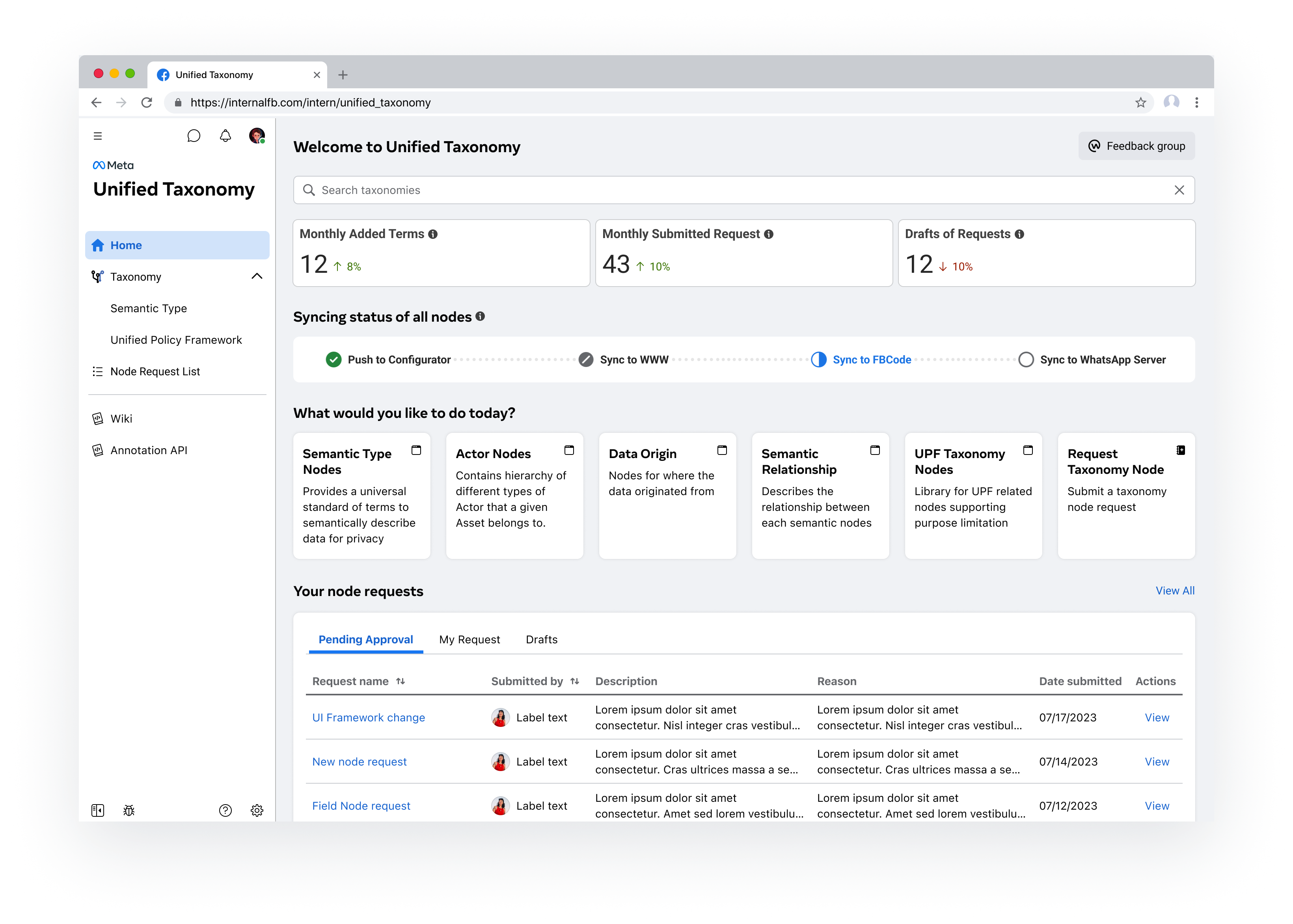
PersonasCategorizing users based on their unique pain points and needs
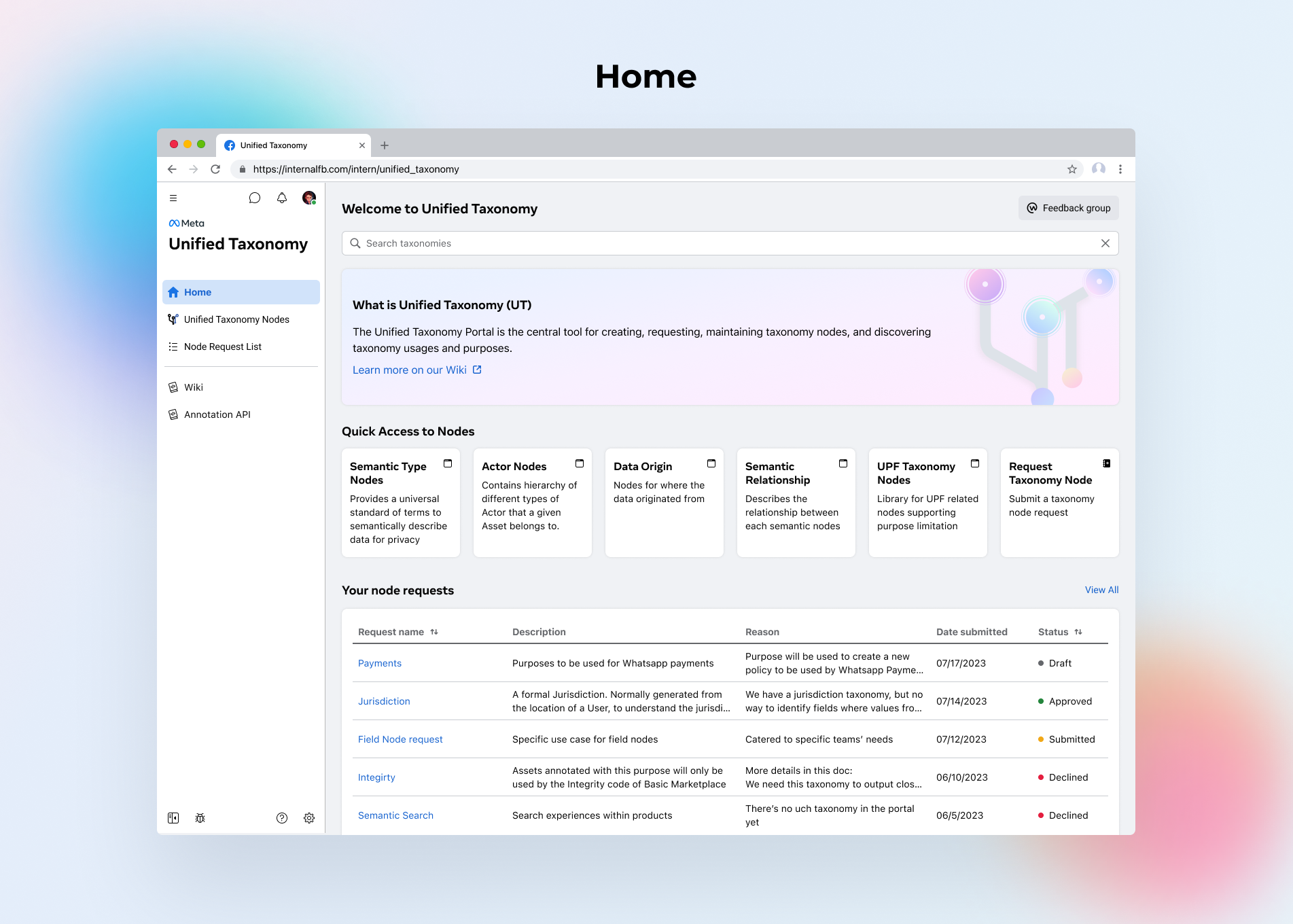
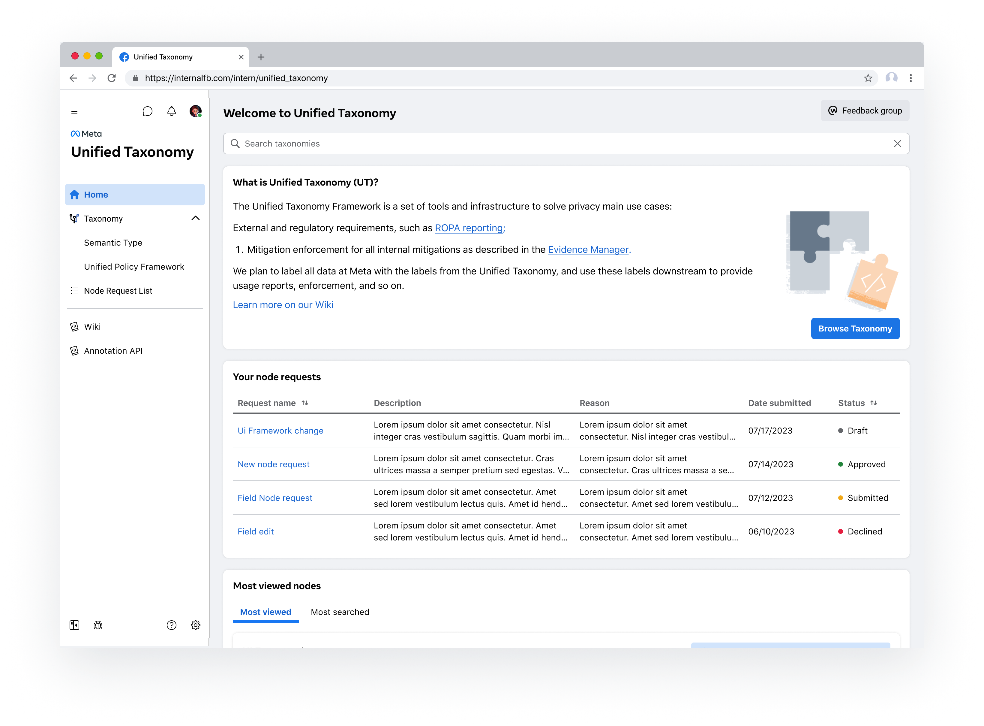
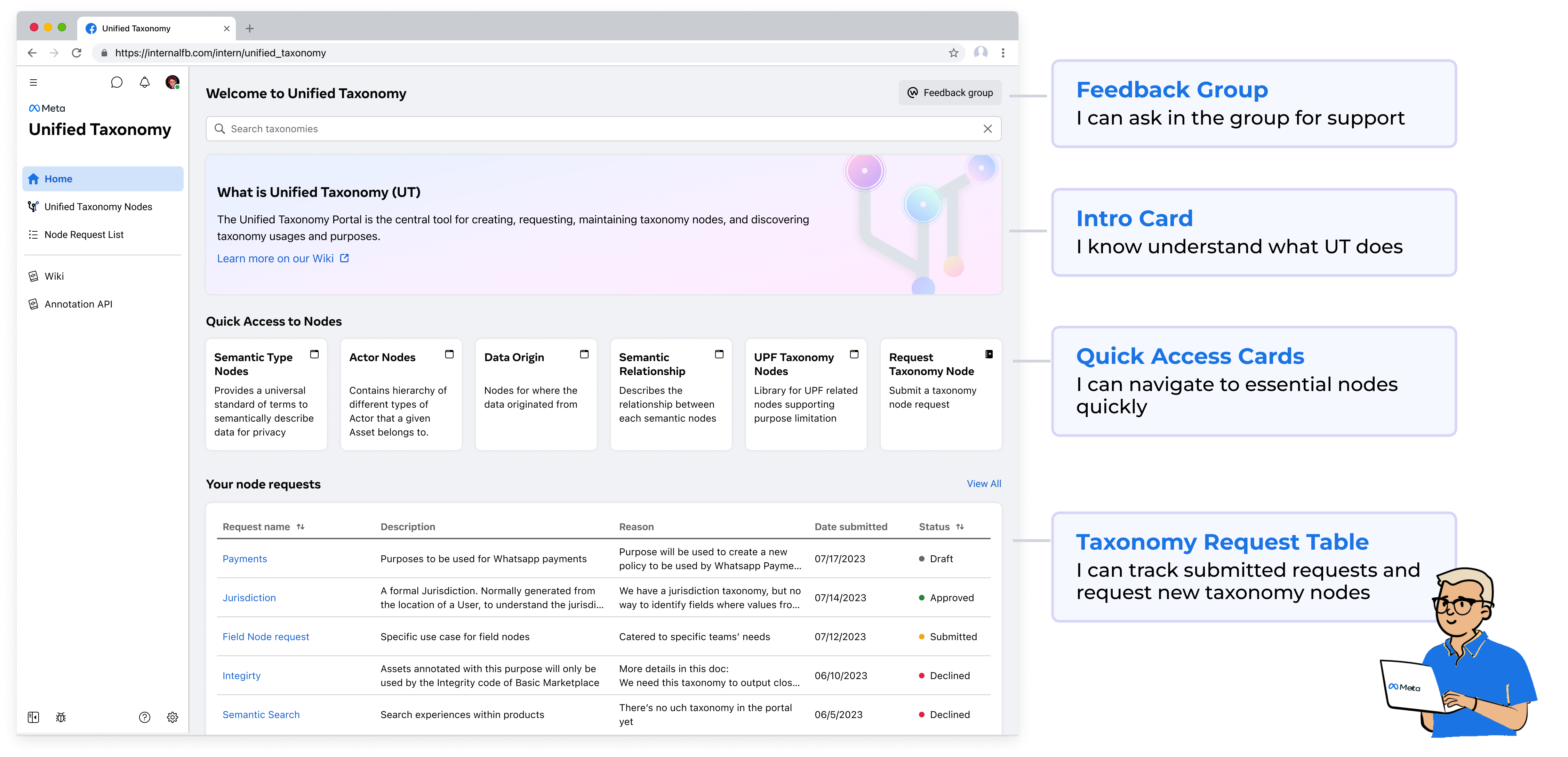
Based on prior research, it's evident that UT has various privacy user types. After engaging in discussions with stakeholders, I categorized them into three main groups based on their purposes for accessing UT and synthesized their needs.

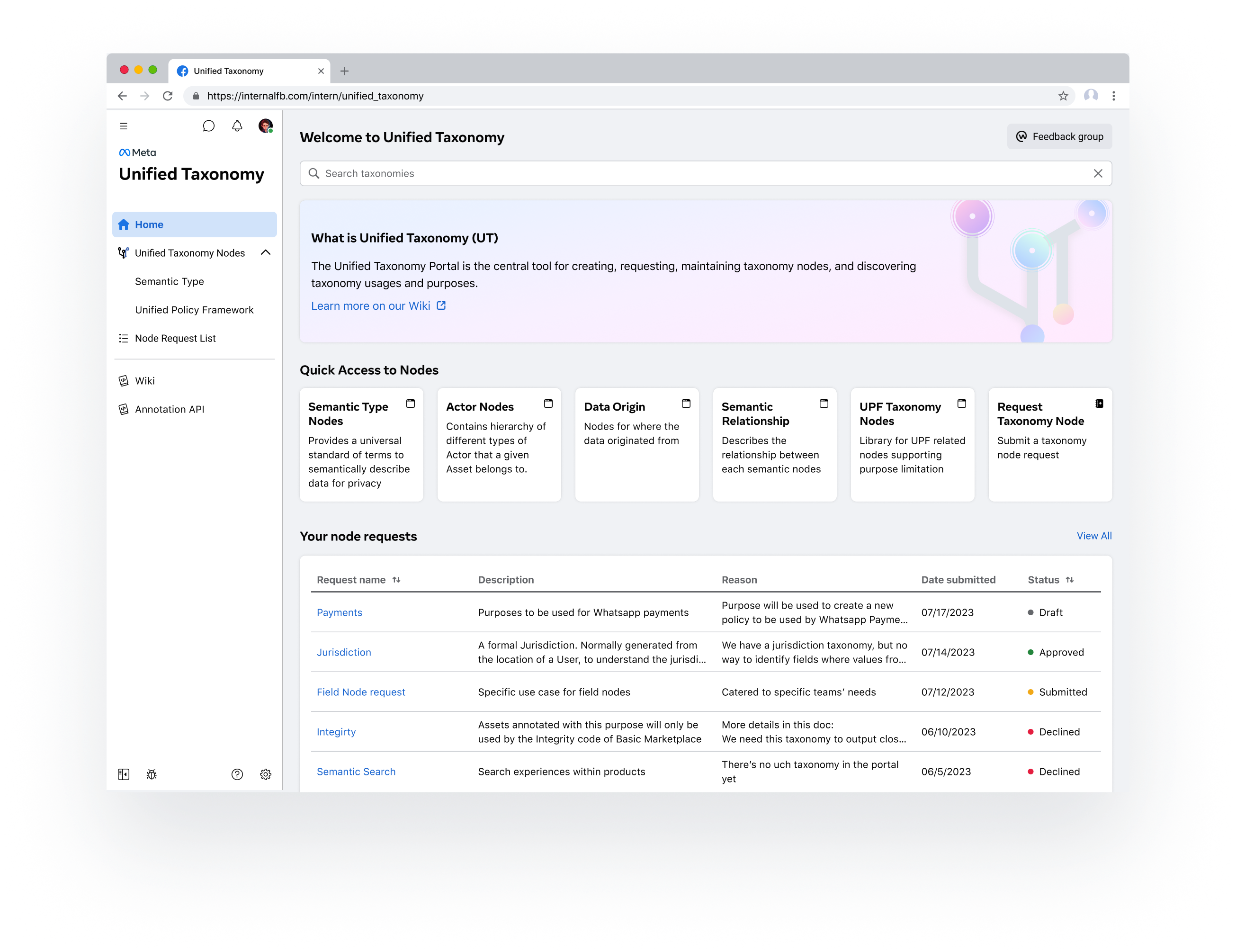
New User
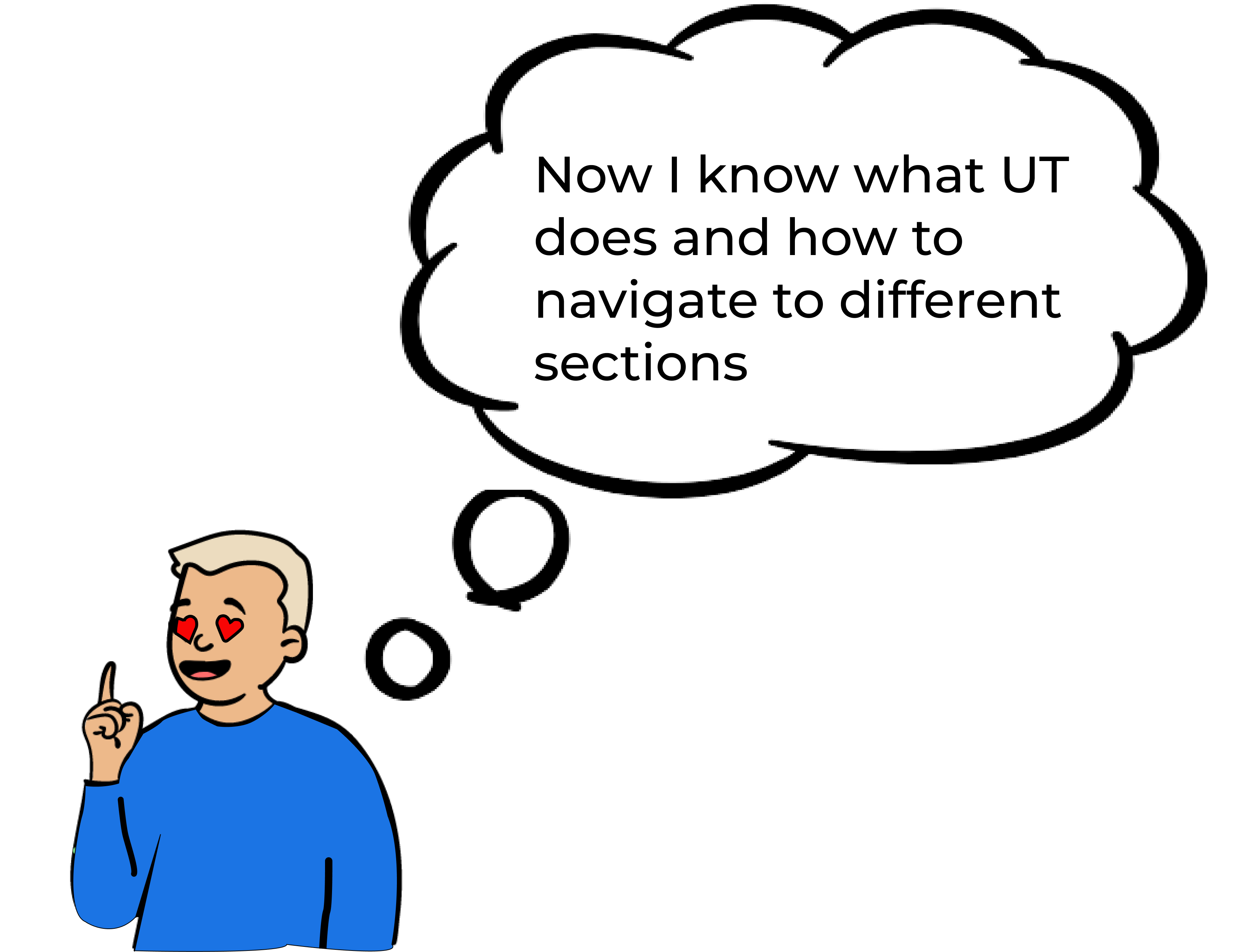
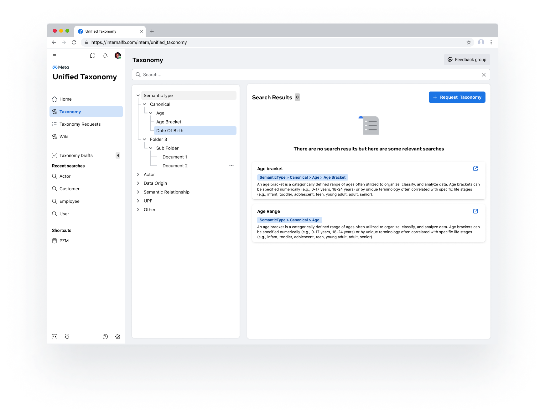
1. Learn UT's features and navigate efficiently
2. Find the right annotation

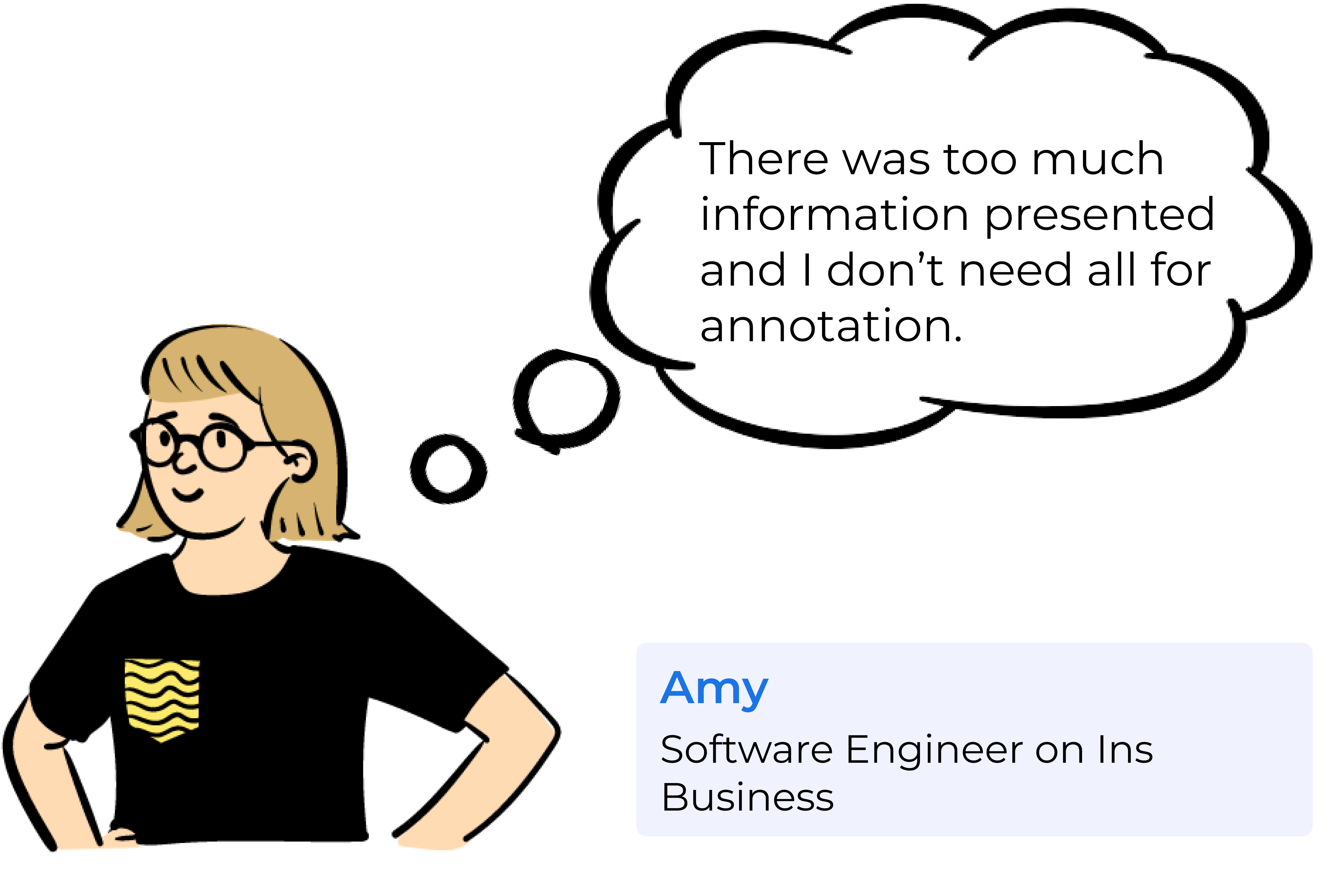
🌟 Focus - Average User
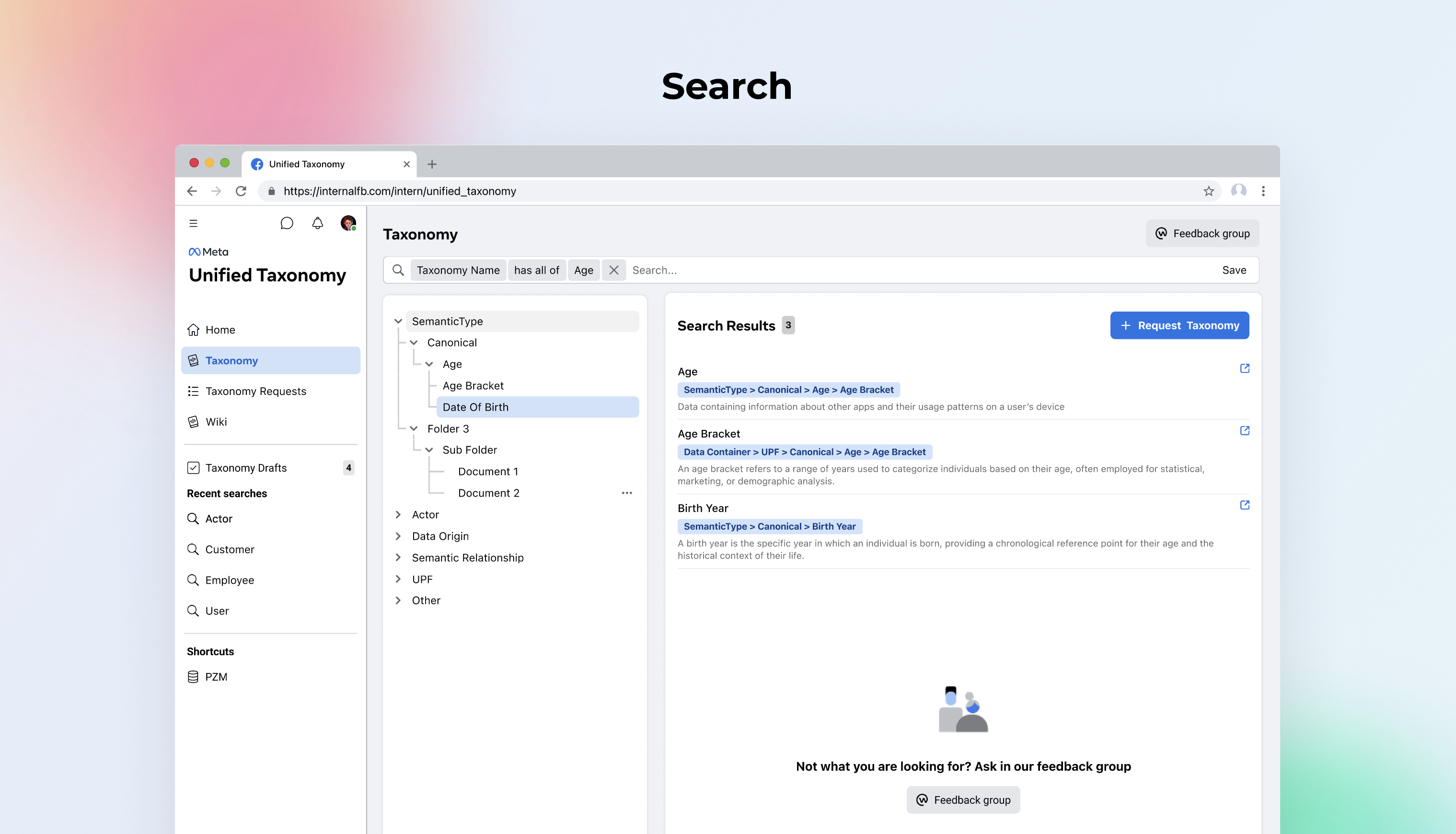
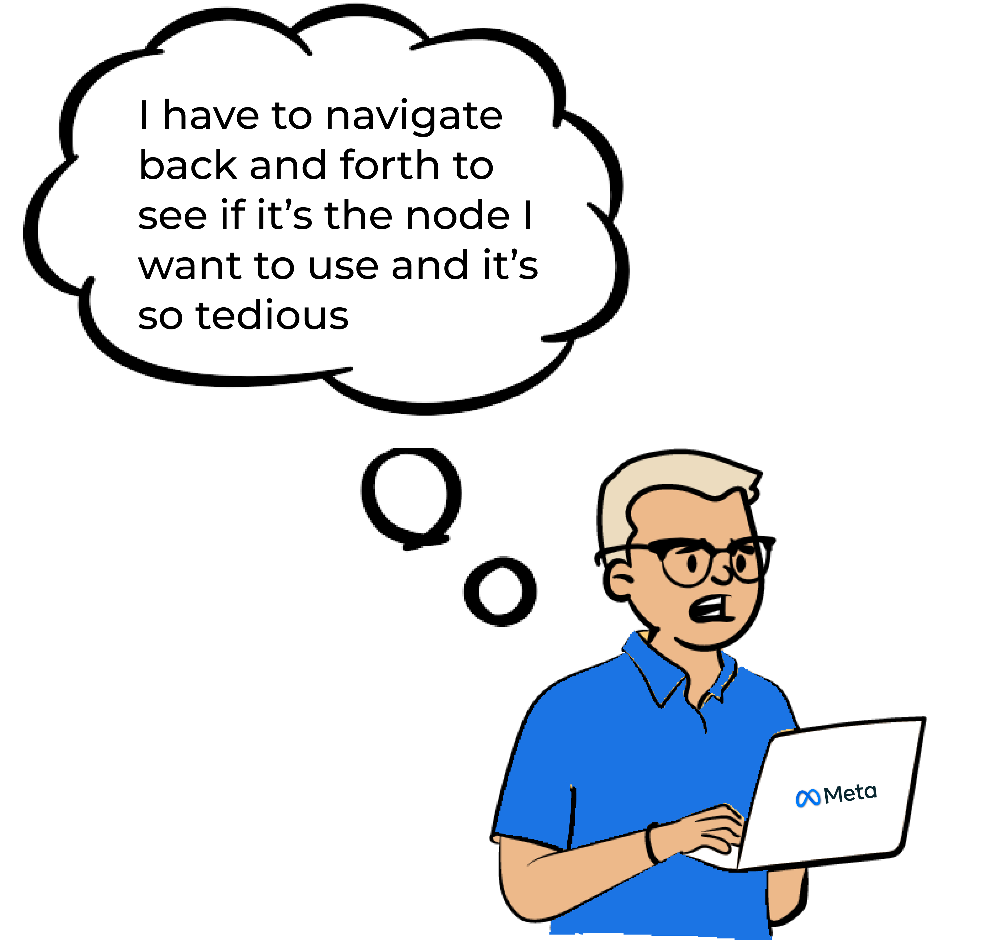
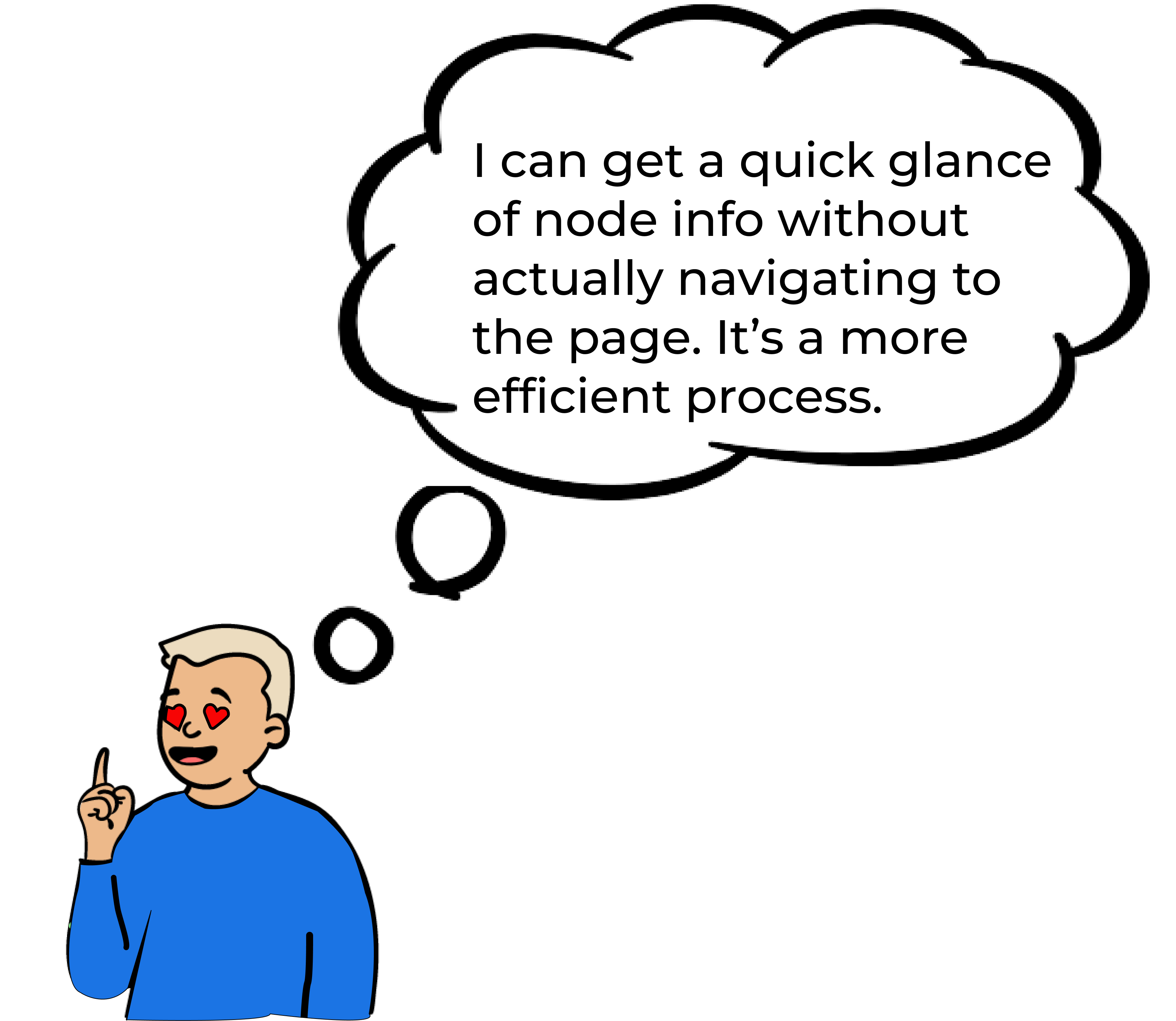
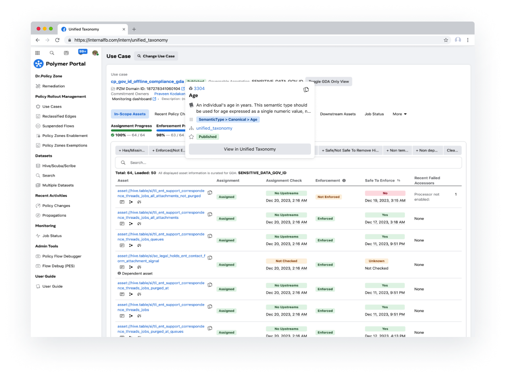
1. Quickly find the right node to annotate
2. Track status of request
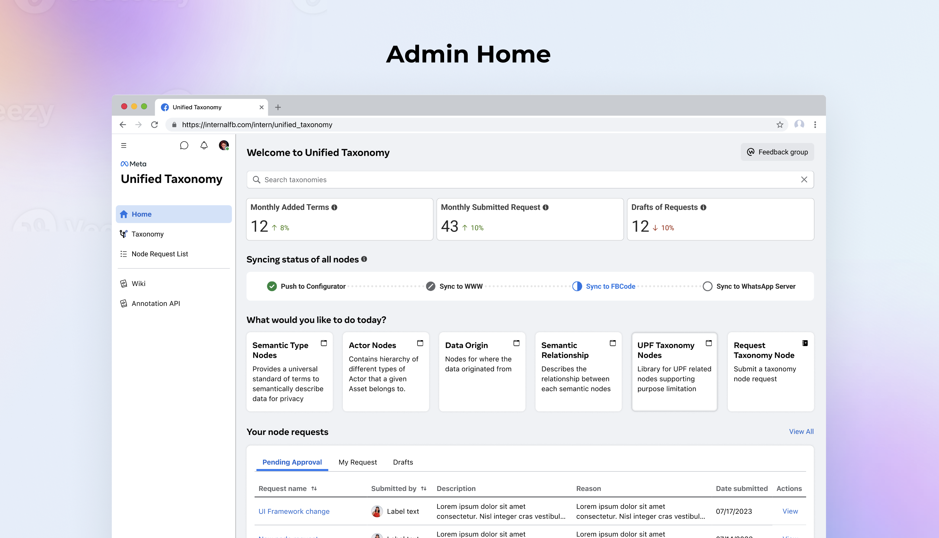
Admin
1. View and approve requests
2. Track taxonomy syncing progress
50+ hours
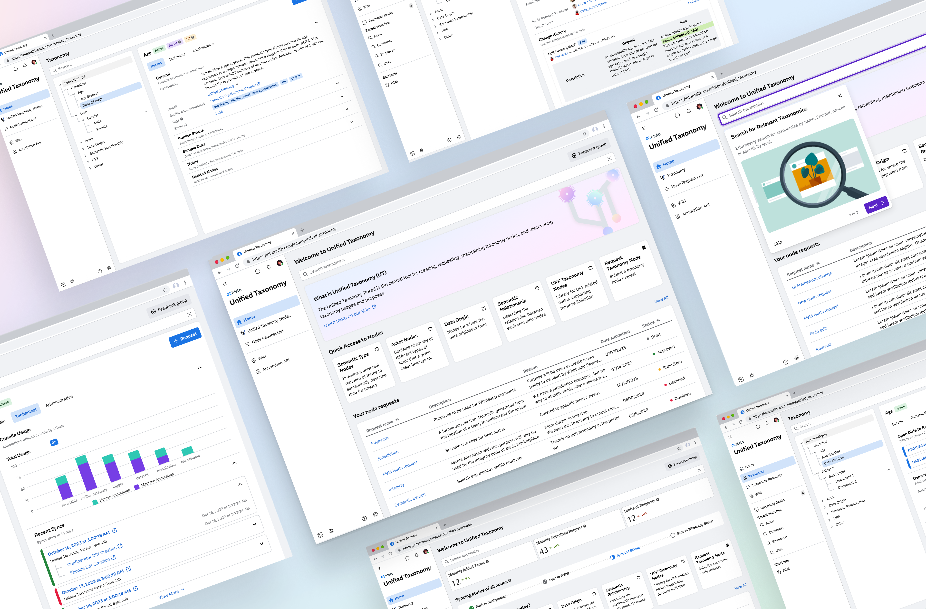
Background Research
on UT and the privacy ecosystem through Wiki, user feedback, and prior research
conducted with internal users including new, existing, and admin users across 3 countries
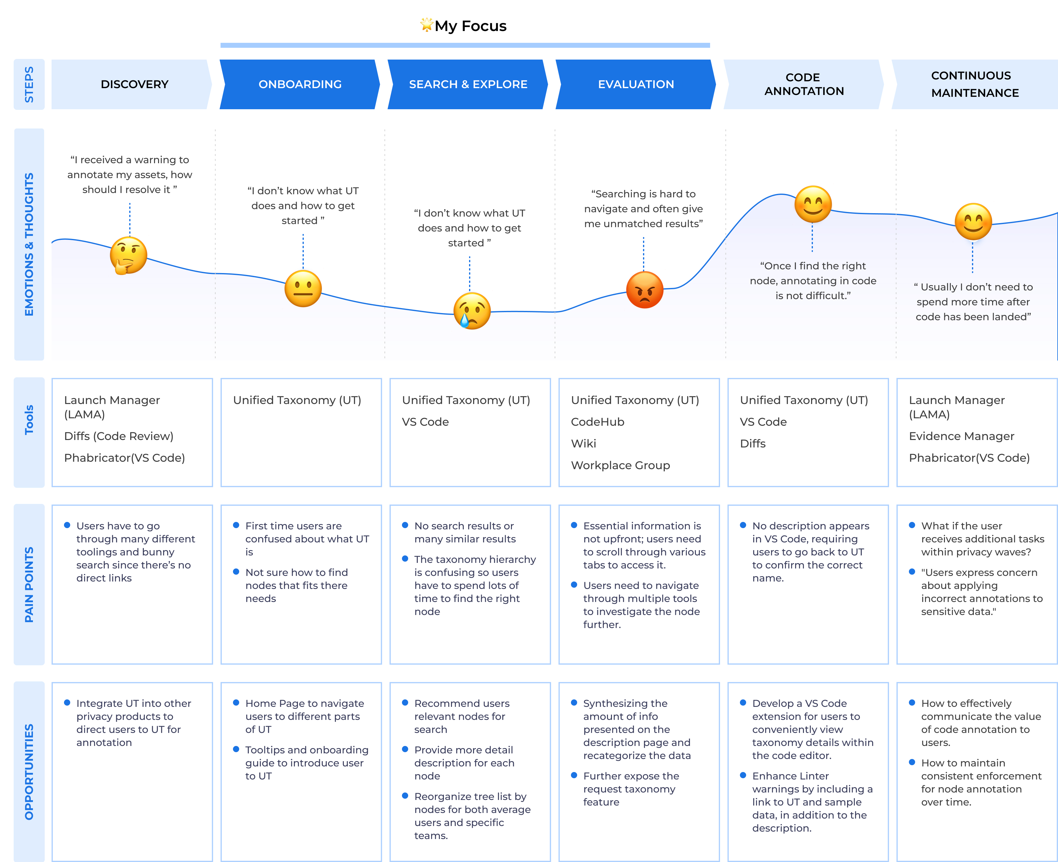
crafted design stories, affinity maps, gap analysis, and Journey maps

🌟 Core User


.svg)